A good landing page is crucial for email marketing campaigns, serving as the bridge between an email message and conversion.
Beehiiv is a powerful newsletter platform that makes it easy to create high-converting landing pages to grow your subscriber base.
By leveraging Beehiiv’s customizable templates and drag-and-drop editor, newsletter publishers can craft landing pages that showcase their content, build trust with readers, and drive signups efficiently.
In this article, we’ll explore some of the best Beehiiv landing page examples to inspire your newsletter growth strategy.
From eye-catching designs to persuasive value propositions, these landing pages demonstrate the key elements that can take your newsletter to new heights.
Whether you are launching a new publication or looking to revamp an existing one, these Beehiiv-powered examples will provide the inspiration you need to create a high-converting landing page that resonates with your target audience.
Let’s dive in!
How to Create a Newsletter Landing Page?
Creating an effective landing page for your newsletter is essential for attracting and converting subscribers.
Whether you’re using a platform like Beehiiv or prefer to create a custom landing page, there are key elements to consider to maximize its impact.
1. Craft a Compelling Headline
Start by creating a bold and attention-grabbing headline that summarizes what your newsletter offers. Use persuasive language to convey the unique value and benefits readers can expect.
2. Visual Appeal
Utilize visuals, such as images or graphics, to capture attention and visually represent the value of your newsletter. A well-designed landing page with engaging visuals can significantly enhance its overall appeal.
3. Set Clear Expectations
Communicate the frequency of your newsletter delivery, the type of content readers can expect, and the value they will receive by signing up. This transparency helps build trust and encourages visitors to take action.
4. Strong Call to Action
Include a prominent and compelling call to action that instructs visitors to sign up for your newsletter. Make it clear and easy for them to take the desired action, and consider using action-oriented language to further motivate them.
5. User-Friendly Design
Ensure your landing page is user-friendly and intuitive to navigate. Keep the design clean and clutter-free, with minimal fields in the sign-up form to reduce friction and increase conversion rates.
6. Track and Optimize
Regularly analyze the performance of your landing page using tools like Google Analytics or Beehiiv’s analytics features. Pay attention to user feedback and data analysis to make continuous improvements over time.
Incorporating these best practices when creating your newsletter landing page will help you effectively showcase the value of your newsletter and entice visitors to subscribe.
Remember to experiment with different elements, personalize the page to align with your brand, and focus on the unique benefits you can provide to readers.
By taking a strategic approach to your landing page, you can boost conversions and maximize the impact of your email marketing efforts.
Also read: Beehiiv vs ActiveCampaign
[lasso id=”18121″ link_id=”249352″ ref=”beehiiv-special”]
7 Beehiiv Landing Pages Examples
1. The Daily Bite
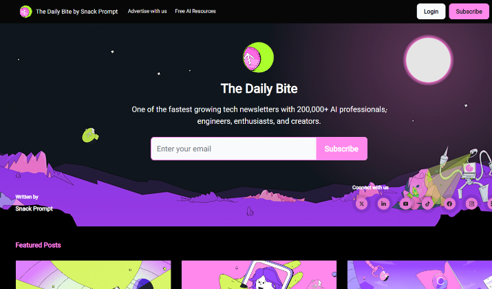
The Daily Bite by Snack Prompt is a shining example of an engaging and effective Beehiiv landing page that knows how to grab the attention of its target audience.
The landing page leads with a bold and enticing value proposition – “One of the fastest growing tech newsletters with 200,000+ AI professionals, engineers, enthusiasts, and creators.”
This immediately communicates the newsletter’s reach and relevance to its niche audience.
Eye-Catching Design
The visual design of The Daily Bite’s landing page is both polished and playful. Vibrant colors, eye-catching icons, and a clean layout create a visually appealing experience that draws the reader in.
The featured posts section showcases the newsletter’s diverse content in an easy-to-digest format.
Seamless Opt-In
Integrating Beehiiv’s powerful newsletter signup tools, The Daily Bite landing page makes it simple for visitors to subscribe.
The opt-in form is prominently displayed and the call-to-action button is clear and compelling. This frictionless signup process helps convert casual visitors into loyal subscribers.
Robust Content Archive
To give potential subscribers a taste of the newsletter’s offerings, The Daily Bite features an extensive archive of past issues.
This allows readers to browse previous content and get a sense of the newsletter’s style and topics. It’s an effective way to build trust and excitement around subscribing.
Overall, The Daily Bite’s Beehiiv-powered landing page is a masterclass in newsletter marketing.
By combining a strong value proposition, visually engaging design, and seamless signup experience, it is an inspiring example for any newsletter looking to grow its audience and engagement.
Check out: Beehiiv vs ConvertKit
2. Milk Road
The Milk Road newsletter has become a sensation in the crypto space, boasting over 250,000 subscribers and a recent multi-million dollar acquisition.
But the secret to their rapid growth lies not just in their insightful crypto analysis – it’s also in the sheer delight of their Beehiiv-powered landing page.
Playful Personality
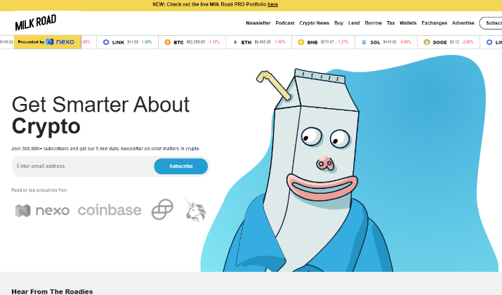
From the moment you land on the Milk Road page, you’re greeted by a whimsical, milk-themed design that instantly puts a smile on your face.
Bright colors, playful illustrations, and a scrolling milk carton graphic create a sense of fun and approachability that’s unique in the often-stuffy world of crypto newsletters.
Concise Value Proposition
Milk Road wasted no time in clearly communicating its value proposition – “Get smarter about crypto.” This bold, to-the-point headline immediately tells visitors what they can expect from the newsletter.
The subheadline reinforces this by highlighting their impressive subscriber count and publishing frequency.
It prominently displays its 250,000+ subscriber base, as well as logos from major crypto players like Coinbase and Binance – signaling that this is a newsletter trusted by industry heavyweights.
Frictionless Signup
Milk Road makes it a breeze for visitors to become subscribers. With not one, but two email capture forms on the page, they ensure that the signup process is quick and seamless.
The scrolling footer popup is an especially clever touch, capturing those who might have otherwise missed the initial CTA.
To give potential subscribers a taste of Milk Road’s content, the landing page features an example newsletter displayed on a smartphone.
This allows visitors to envision themselves reading the publication, further stoking their interest and desire to sign up.
The Milk Road Beehiiv landing page is a masterclass in newsletter marketing.
By blending a playful brand identity, crystal-clear value proposition, social proof, and frictionless signup, they’ve created an experience that is as delightful as it is effective.
Explore: Beehiiv vs LinkedIn Newsletter
[lasso id=”18121″ link_id=”249353″ ref=”beehiiv-special”]
3. The Publish Press
The Publish Press is a newsletter designed specifically for creators like you. If you’re looking for the latest updates and news in the creator community,
The Publish Press has got you covered. With a team of experienced professionals behind it, this newsletter delivers valuable insights and resources straight to your inbox.
Persuasive Value Proposition
One of the standout features of The Publish Press is its clear and concise communication.
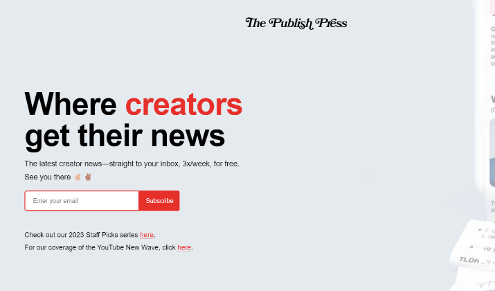
The landing page captures your attention with a bold headline that states, “Where Creators Get Their News.” This simple message immediately lets you know what the newsletter is all about and what you can expect as a subscriber.
Consistent Performance
The creators behind The Publish Press understand the importance of delivering valuable and timely content to their subscribers. They ensure you stay up-to-date by providing creator news three times a week.
This regular cadence keeps you informed about the latest trends, industry insights, and success stories from top creators.
Visual Impact
What sets The Publish Press apart is its ability to leverage trust and expertise through visual communication.
The landing page includes a graphic showcasing an example of their newsletter. It features recognizable faces of successful creators, including the likes of Mr. Beast.
By associating themselves with these well-known figures, The Publish Press establishes credibility within the creator community.
Concise Signup Form
The signup form on the Publish Press landing page is straightforward and uncluttered. It only asks for an email address, minimizing friction in the signup process.
The form is strategically placed at the top, middle, and bottom of the page to maximize visibility and conversion opportunities.
Engaging Content Samples
To give visitors a taste of the newsletter’s content, Publish Press features excerpts from recent issues.
This allows potential subscribers to see the quality and style of the content they can expect, further encouraging them to sign up.
Overall, the Publish Press landing page is an excellent example of how to effectively promote a newsletter using Beehiiv’s tools and best practices.
By subscribing to this newsletter, you gain access to expert insights and stay ahead of the game in the rapidly evolving world of content creation.
Whether you’re just starting your journey as a creator or you’re already a seasoned professional, The Publish Press provides valuable information and resources to help you thrive.
Read this too: Beehiiv Promo Code – 20% Off Coupon
4. Payload
Payload is a space newsletter that brings you the latest updates and insights into the business of space.
As Italian designer Massimo Vignelli once emphasized, design is a language, and Payload understands the importance of using design to communicate effectively.
Visually Appealing Design
Studies on perception have shown that humans are influenced by the appearance of high quality.
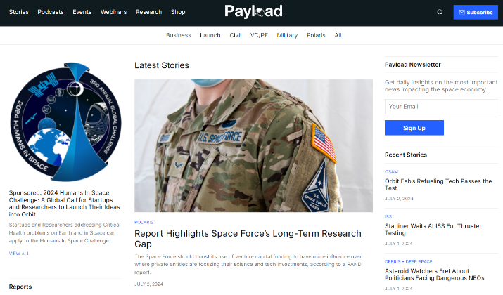
Payload’s visually appealing and well-designed newsletter captures attention and entices readers to engage with the content.
When scrolling through the newsletter, Payload subtly changes visuals and background colors, creating a dynamic and immersive reading experience.
This attention to detail keeps readers engaged and enhances the overall aesthetic appeal.
To break away from text-heavy sections, Payload employs high-resolution photos with attention-grabbing colors, similar to what The B-Side does in their newsletter.
This visual strategy provides a visual break and keeps the content fresh and captivating.
Social Proof
Additionally, Payload showcases social proof by highlighting authoritative organizations that read their newsletter. They also feature reviews from C-suite executives, establishing credibility and trust among their audience.
Easy Sign-up Options
With multiple subscription forms strategically placed on its landing page, Payload maximizes sign-up opportunities and emphasizes its commitment to providing valuable content to its subscribers.
As the business of space continues to evolve, Payload remains at the forefront, delivering timely and insightful updates that keep their subscribers informed and engaged.
Check out: Beehiiv Free Trial – How To Get It?
[lasso id=”18121″ link_id=”249354″ ref=”beehiiv-special”]
5. Homescreen
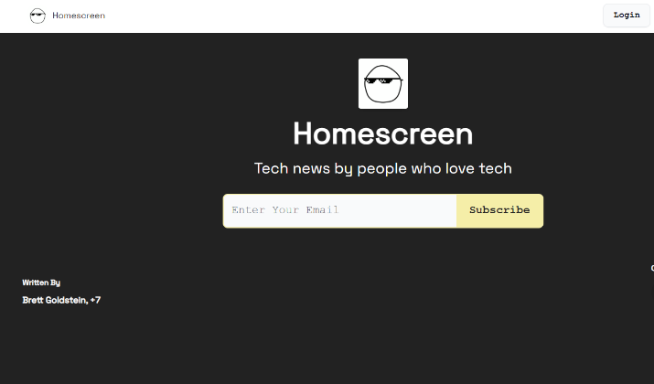
Homescreen, a renowned founder newsletter, understands the importance of impactful design in capturing the attention of its target audience.
Interesting Design Elements
Their visually enticing graphics and carefully curated design elements set them apart from other business newsletters.
One key aspect that differentiates Homescreen is its emphasis on engaging and humorous content. They know that founders and entrepreneurs value pertinent news delivered in a relatable and entertaining manner.
Clear Value Proposition
On their newsletter landing page, Homescreen effectively communicates the value of subscribing.
They provide a clear overview of the benefits, showcasing how their newsletters offer valuable insights and news for founders.
Visitors also have the opportunity to preview sample newsletters, giving them a taste of what they can expect by joining the Homescreen community.
By effectively conveying their value proposition and engaging visitors with their unique style, Homescreen stands as a top choice for founders seeking relevant and engaging content.
Their visually appealing and carefully crafted newsletter landing page exemplifies the importance of design and branding in capturing the attention of their target audience.
You might like this: Beehiiv vs GetResponse
6. Fantasy Life
Fantasy Life is a popular football newsletter that has amassed over 300,000 subscribers.
Founded by Matthew Berry, a leading sports and fantasy football expert, Fantasy Life provides football enthusiasts with valuable insights, expert analysis, and the latest updates in the world of fantasy football.
Powerful Design Elements
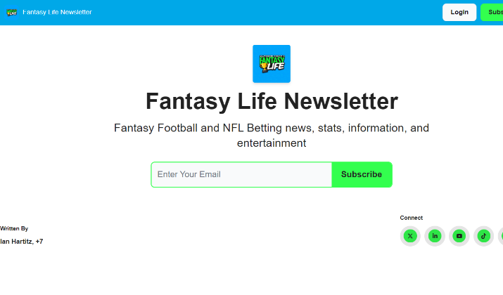
The page features a simple, yet clear call-to-action button prominently displayed, encouraging visitors to sign up.
To give readers a taste of the newsletter’s content, the landing page includes sample newsletters showcasing the latest fantasy football news and insights.
This allows potential subscribers to preview the type of engaging content they can expect as a Fantasy Life subscriber, further driving signups
Harnessing the Potential of Beehiiv
Since switching to Beehiiv, The Fantasy Life Newsletter has experienced remarkable improvements in performance.
The newsletter saw a 100% increase in open rates and a staggering 200% increase in click-through rates.
These impressive results demonstrate the effectiveness of Beehiiv’s platform in helping Fantasy Life engage and connect with its audience.
Not only did The Fantasy Life Newsletter achieve exceptional results, but the switch to Beehiiv also brought about significant growth in the team.
The newsletter’s team expanded from having no full-time staff to a dedicated team of five individuals.
This growth is a testament to the scalability and impact of Beehiiv’s platform in supporting the growth and success of newsletters.
Also read: 10 Best Fonts For Newsletters
7. Arnold’s Pump Club
Arnold’s Pump Club, the health and fitness newsletter created by the legendary Arnold Schwarzenegger, boasts a Beehiiv landing page that perfectly captures the vintage appeal and encouraging spirit of the newsletter itself.
Vintage Visuals
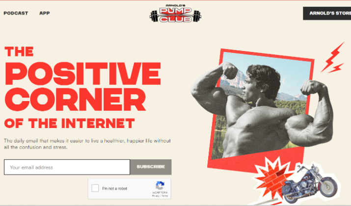
The landing page’s design is dominated by striking black-and-white photos of a young Arnold in his bodybuilding heyday, interspersed with bold red text and graphics.
This vintage aesthetic immediately sets the tone for the newsletter’s classic, old-school vibe while grabbing the visitor’s attention.
Motivational Messaging
Arnold’s Pump Club’s landing page leads with an uplifting headline promising “A healthier, happier life without all the confusion and stress.”
This positive messaging aligns perfectly with the newsletter’s mission to simplify health and fitness for its readers. Encouraging words like “simplify,” “easier,” and “positive” reinforce the supportive tone.
Celebrity Appeal
Of course, no discussion of Arnold’s Pump Club would be complete without acknowledging the star power of its creator.
As one of the most famous bodybuilders and actors of all time, Arnold Schwarzenegger’s name alone is enough to pique the interest of fitness enthusiasts and health-conscious subscribers.
Compelling Content Samples
To give potential subscribers a taste of what they can expect, the landing page features a sample newsletter showcasing the type of valuable content found in each issue.
From weekly workouts to research-backed health insights, Arnold’s Pump Club delivers a wealth of information in an engaging, easy-to-read format.
Overall, Arnold’s Pump Club’s Beehiiv landing page is a masterclass in using design, messaging, and celebrity appeal to attract and convert newsletter subscribers.
By tapping into the nostalgia and motivation of its target audience, it sets the stage for a newsletter experience that is both classic and cutting-edge.
Check out: Beehiiv vs AWeber
[lasso id=”18121″ link_id=”249355″ ref=”beehiiv-special”]
Conclusion
Well-designed landing pages maximize the performance of your email marketing campaigns, particularly when using paid ads.
By following landing page best practices and taking inspiration from successful examples like The Daily Bite and Milk Road, you can create compelling newsletter landing pages that convert visitors into loyal subscribers.
Remember to remove any distractions, ask for necessary information, and place primary elements above the fold to keep the focus on the desired action.
By leveraging Beehiiv’s landing page features, newsletter creators can craft high-converting experiences that effectively showcase their content and convert casual visitors into loyal subscribers.


