In the world of digital marketing, newsletters remain one of the most effective ways to engage with your audience and drive results.
However, crafting a successful newsletter involves more than just compelling content – the typography you choose plays a crucial role in determining its readability, branding, and overall impact.
With so many font options available, it can be challenging to know which ones will work best for your newsletter.
In this comprehensive guide, we’ll explore the top fonts for newsletters, offer tips on pairing them effectively, and share best practices for formatting your text to maximize readability and engagement.
Let’s dive in and discover the perfect fonts to elevate your newsletter to new heights!
Why Choose the Right Newsletter Font?
The font you select for your newsletter can have a significant impact on its overall effectiveness and engagement.
Here’s why choosing the right newsletter font is so crucial:
Readability & Legibility
The primary purpose of a newsletter is to convey information to your readers.
If the font you choose is difficult to read, it can strain the eyes and make your content hard to engage with. Factors like font size, line spacing, and letter spacing all contribute to readability.
Selecting a clean, highly legible font is essential for ensuring your newsletter is easy to scan and comprehend.
Branding & Tone
The font you use in your newsletter can also reinforce your brand identity and set the tone for your content.
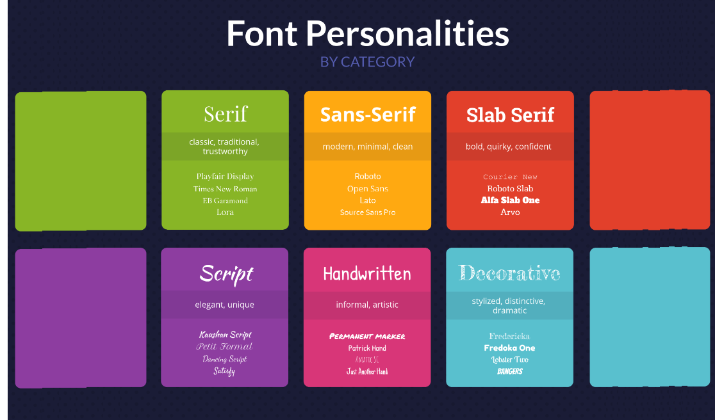
A classic serif font may convey a sense of authority and professionalism, while a modern sans-serif font could project a more approachable, friendly vibe.
Choosing a font that aligns with your brand’s personality and values can help strengthen recognition and recall.
Email Client Compatibility
Not all fonts are created equal when it comes to email compatibility.
Some fonts may not render properly or could even be replaced by default system fonts in certain email clients. This can disrupt the intended design and layout of your newsletter.
It’s important to select web-safe fonts that are widely supported across email platforms to ensure a consistent, high-quality experience for your readers.
By carefully considering these factors, you can select a newsletter font that enhances readability, reinforces your brand, and delivers a seamless experience for your subscribers – ultimately driving higher engagement and conversions.
Also read: Best Times To Post On Beehiiv
[lasso id=”18121″ link_id=”247550″ ref=”beehiiv-special”]
Considerations for Choosing the Right Font
When selecting fonts for your newsletter, it’s important to take several factors into consideration to ensure readability and visual appeal.
Font size, line height, color contrast, and the number of fonts used all play a significant role in creating an engaging and professional design.
Font Size
The font size you choose for your newsletter can greatly affect readability.
It’s recommended to use a font size of 16px or higher for body text to ensure that it’s easily legible across various devices and layouts.
For headlines, a font size of 24px or higher can create visual impact and draw the reader’s attention.
Line Height
The spacing between lines of text, known as the line height or leading, plays a significant role in the readability of your newsletter.
A line height that is 1.5 times the font size is generally recommended to ensure comfortable reading experiences and prevent text from appearing cramped or too tightly spaced.
Color Contrast
Ensuring sufficient contrast between the text and background is crucial for readability, especially for individuals with visual impairments.
Black text on a white background is considered the most legible combination for longer blocks of text.
However, for headlines or important elements, you can experiment with colored text for better visual impact.
Number of Fonts
While it can be tempting to use a variety of fonts in your newsletter, it’s generally best to limit the number of fonts used to maintain a clean and cohesive design.
Using too many fonts can create visual clutter and make your newsletter appear unprofessional. Stick to a maximum of three fonts to ensure consistency and readability.
By considering these factors when choosing fonts for your newsletter, you can create a visually appealing design that captures your readers’ attention and delivers your message effectively.
Check out: Beehiiv vs SendFox
Best Fonts For Newsletters
When it comes to choosing fonts for your newsletter, web-safe options are a reliable choice that ensures compatibility across email clients and devices.
Here are some of the best fonts to consider for your newsletter:
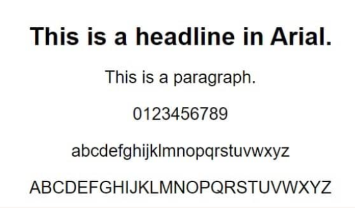
1. Arial
Arial is a classic sans-serif font that is highly readable and web-safe, making it an excellent choice for newsletter body text.
Designed in 1982 by Robin Nicholas and Patricia Saunders, Arial has a clean, professional appearance that works well across a variety of newsletter styles and branding.
The generous spacing between letters and lines in Arial ensures excellent legibility, even at smaller font sizes.
This readability is further enhanced by Arial’s neutral tone and lack of decorative flourishes, allowing the content to take center stage.
The font’s widespread use and web-safe nature also guarantee it will display properly across email clients and devices.
While Arial may not have the same level of personality as some other sans-serif options, its versatility and reliability make it a go-to choice for newsletter body copy.
Pairing Arial with a more distinctive font for headings and accents can create an appealing visual hierarchy that keeps readers engaged.
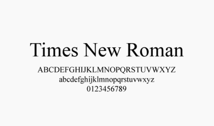
2. Times New Roman
Times New Roman is a timeless serif font that is easy to read, especially in smaller sizes.
Designed in 1932 by Stanley Morison, this classic font conveys a traditional, formal tone that can lend an air of authority and credibility to newsletter content.
The serifs in Times New Roman guide the eye and reduce eye strain, making it an excellent choice for lengthy passages of text.
Its elegant, book-like aesthetic also complements a wide range of newsletter designs, from corporate communications to literary publications.
While Times New Roman may not be the most modern or distinctive font option, its reliability and readability make it a safe choice for newsletter body copy.
Combining it with a more contemporary sans-serif font for headings can create an appealing visual contrast that keeps the design fresh and engaging.
Explore: Beehiiv vs Flodesk
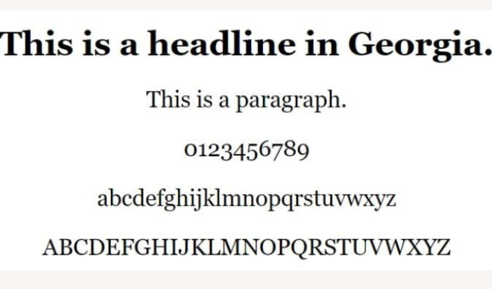
3. Georgia
Georgia is a serif font with a slightly more modern feel than the traditional Times New Roman.
Designed in 1993 by Matthew Carter, Georgia has excellent readability on screens, making it a great choice for newsletter content that will be viewed primarily on digital devices.
The subtle variations in stroke width and serifs give Georgia a distinctive personality that can add visual interest to newsletter designs.
Its clean, elegant appearance also complements a wide range of branding and design styles, from classic to contemporary.
Georgia’s high legibility, even in smaller sizes, makes it a reliable option for newsletter body copy.
Pairing it with a sans-serif font for headings can create a harmonious typographic hierarchy that guides the reader’s eye and enhances the overall aesthetic.
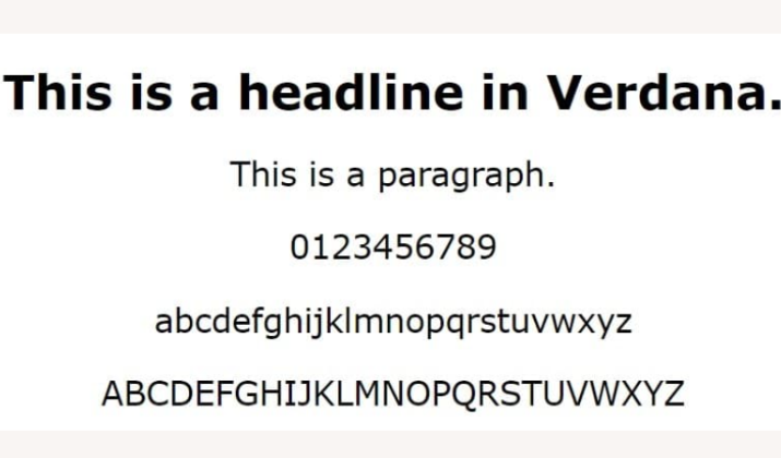
4. Verdana
Verdana is a sans-serif font that was designed specifically for on-screen reading.
Developed by Matthew Carter in 1996, Verdana features generous spacing between letters and lines, ensuring excellent legibility even at smaller font sizes.
The clean, approachable aesthetic of Verdana makes it a versatile choice for newsletter body text. Its web-safe side and compatibility across email clients also guarantee a consistent, high-quality display of your content.
While Verdana may not have the same level of personality as some other sans-serif options, its focus on readability and on-screen performance make it a practical and reliable choice for newsletter designs.
Combining Verdana with a more distinctive font for headings and accents can create a visually appealing and functional newsletter layout.
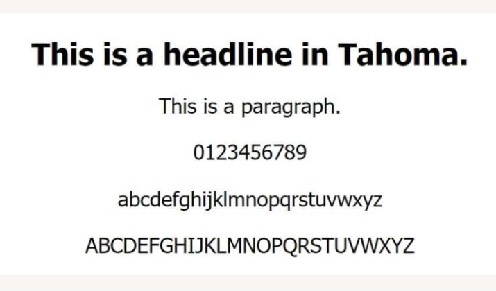
5. Tahoma
Tahoma is a slightly condensed sans-serif font that works well for both headings and body text in newsletters.
Designed by Matthew Carter in 1994, Tahoma has a professional, polished appearance that complements a wide range of newsletter styles and branding.
The compact nature of Tahoma makes it a practical choice for newsletter layouts where space is at a premium. Its excellent readability, even in smaller sizes, ensures your content remains easy to scan and comprehend.
While Tahoma may not have the same level of personality as some other sans-serif options, its versatility makes it a reliable choice for newsletter typography.
Pairing Tahoma with a more expressive font for accents or headings can create a visually balanced and cohesive design.
Read this too: Beehiiv vs Revue
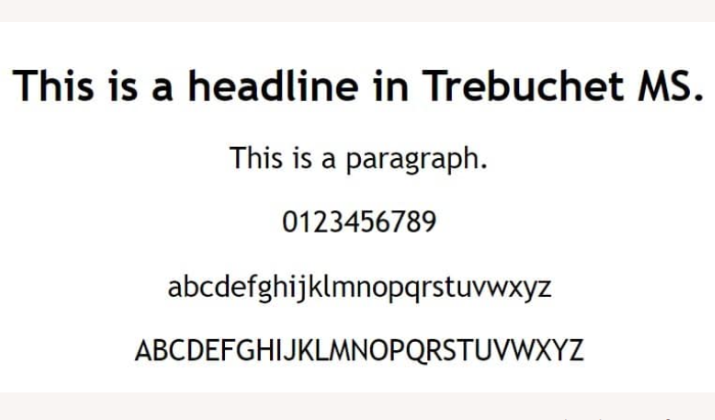
6. Trebuchet MS
Trebuchet MS is a versatile sans-serif font that offers a bit more personality than some other standard options.
Designed by Vincent Connare in 1996, Trebuchet MS has subtle curves and strokes that give it a slightly more distinctive appearance compared to more neutral sans-serif fonts like Arial or Verdana.
This makes Trebuchet MS a great choice for adding a touch of style to newsletter elements like headings, subheadings, and calls-to-action, without sacrificing readability.
Its balanced, modern aesthetic complements a wide range of newsletter designs and branding.
While Trebuchet MS may not be ideal for lengthy body copy due to its slightly more decorative nature, it can be used effectively for shorter blocks of text.
The web-safe status also ensures it will display properly across email clients.
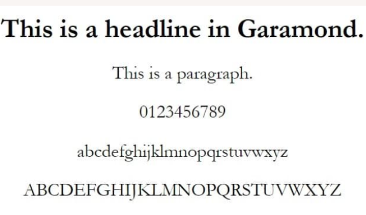
7. Garamond
Garamond is a classic serif font with elegant, old-style letterforms that convey a sophisticated, high-quality feel.
Originating in the 16th century, this timeless font has been used in print media for centuries, lending an air of authority and tradition.
The subtle stroke variations and classic serifs of Garamond make it an excellent choice for newsletter body copy, where its readability and formal tone can enhance the professionalism and credibility of the content.
Pairing Garamond with a more modern sans-serif font for headings can create an appealing visual contrast.
Garamond’s refined, elegant aesthetic also makes it well-suited for newsletters focused on luxury, finance, or other industries where a polished, prestigious image is important.
Its versatility allows it to work across a range of newsletter styles and brand identities.
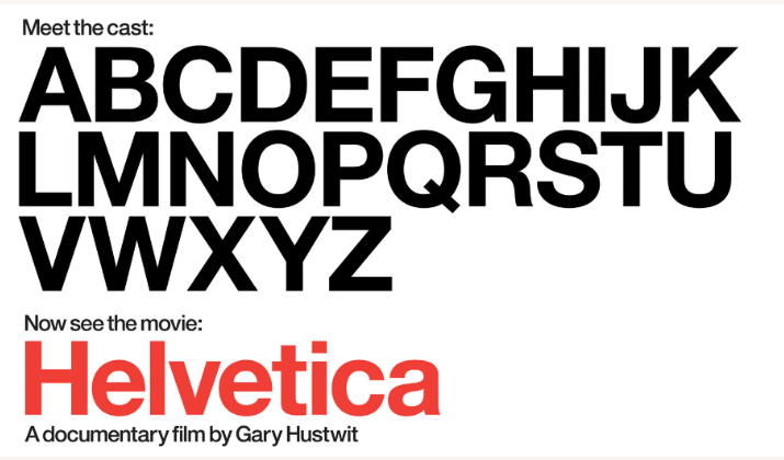
8. Helvetica
Helvetica is a clean, neutral sans-serif font that is widely regarded as a design classic. The font is web-safe and ensures reliable cross-platform compatibility as well.
Its minimalist, no-frills appearance makes it a great choice for branding and headlines in newsletters. Its versatility makes it easy to pair with a variety of other typefaces.
The simplicity and legibility of Helvetica allow it to function as a strong supporting player, complementing more expressive fonts used for body copy or accents.
While Helvetica may not have the same level of personality as some other sans-serif options, its timeless, professional look can help create a sense of sophistication and authority in newsletter designs.
You might like this: Beehiiv vs Klaviyo
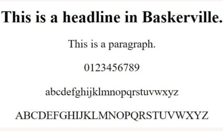
9. Baskerville
Baskerville is a traditional serif font with a warm, inviting tone that works well for newsletter body copy.
Designed in the 18th century by John Baskerville, this font features elegant, slightly rounded letterforms that convey a sense of refinement and approachability.
The high readability of Baskerville makes it an excellent choice for lengthy passages of text, as its serifs guide the eye and reduce eye strain.
Its classic, book-like aesthetic can also lend an air of credibility and trustworthiness to newsletter content.
Pairing Baskerville with a more modern sans-serif font for headings and accents can create an appealing visual balance, blending tradition and innovation.
Its warm, inviting personality makes Baskerville well-suited for newsletters focused on lifestyle, arts, or other content aimed at cultivating an engaged, loyal readership.
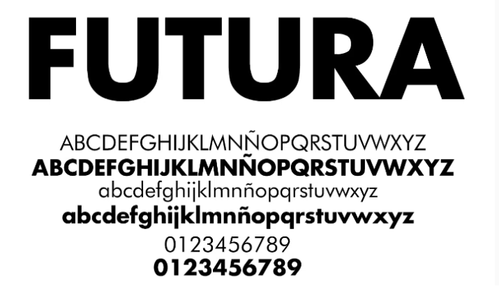
10. Futura
Futura is a geometric sans-serif font with a modern, minimalist aesthetic that can add visual interest to newsletter headers, callouts, and other display elements.
Designed in the 1920s by Paul Renner, Futura’s clean lines and angular forms convey a sense of simplicity and efficiency.
The bold, distinctive nature of Futura makes it a great choice for adding emphasis and hierarchy to newsletter layouts.
Its geometric shapes and lack of serifs also allow it to function as a strong contrast to more traditional serif fonts used for body copy.
While Futura may not be the most readable choice for lengthy text, its impact and versatility make it well-suited for newsletter designs that prioritize a sleek, contemporary look.
Also read: Substack vs Beehiiv vs ConvertKit
[lasso id=”18121″ link_id=”247551″ ref=”beehiiv-special”]
How to Pair the Right Fonts for Your Newsletter Design?
When selecting fonts for your newsletter, it’s important to consider how they will work together to create a cohesive and visually appealing design.
Here are some key principles to keep in mind when pairing fonts:
Serif and Sans-Serif Combinations
One of the most classic and effective font pairings is combining a serif font for headings and body copy with a complementary sans-serif font for subheadings, callouts, and other display elements.
This contrast between the two font families can create visual interest and establish a clear hierarchy.
For example, you could use a timeless serif font like Garamond or Baskerville for the main body text, paired with a modern, clean sans-serif like Helvetica or Futura for headings and accents.
The serif font provides warmth and readability for the longer passages, while the sans-serif adds a sense of structure and emphasis.
Contrasting Font Styles
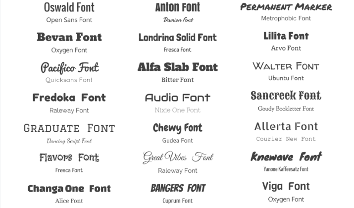
Beyond just pairing serif and sans-serif fonts, you can also create visual interest by combining fonts with distinctly different styles and personalities.
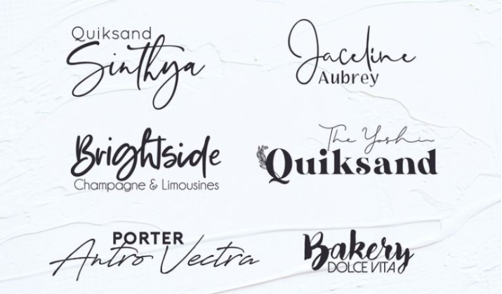
This could mean juxtaposing a classic, formal font with a more casual, handwritten one, or pairing a bold, geometric font with a delicate, script-like one.
For instance, you might use a bold, condensed sans-serif like Tahoma for newsletter section headers, while employing a more expressive, script-based font like Miamo for pull quotes or callouts.
The contrast between these font styles can make your newsletter design more dynamic and engaging.
Achieving Visual Hierarchy
Effective font pairing is not just about creating visual interest – it’s also about establishing a clear hierarchy and guiding the reader’s eye through your newsletter content.
By using different font styles, sizes, and weights strategically, you can highlight the most important information and create a sense of flow.
For example, you could use a large, attention-grabbing header font for your newsletter title, followed by a slightly smaller serif font for section headings, and then a comfortable, readable sans-serif for the body copy.
This typographic hierarchy helps organize the content and makes it easy for readers to navigate your newsletter.
Remember, the key is to strike a balance between contrast and cohesion. Your font pairings should work together to support your newsletter’s branding, readability, and overall design aesthetic.
Explore: GoHighLevel vs Beehiiv
Choosing Fonts that Reflect Your Brand
When selecting fonts for your newsletter, it’s important to choose options that align with and reinforce your brand identity.
The fonts you use can have a significant impact on how your newsletter is perceived and how effectively it communicates your brand’s personality and values.
Matching Font Personality to Brand Identity
Different font styles and characteristics can convey very different moods and emotions.
A classic, elegant serif font like Garamond may project a sense of sophistication and authority, while a modern, geometric sans-serif like Futura could suggest a more innovative, minimalist brand identity.
Consider the personality and tone you want to establish for your newsletter, and choose fonts that seamlessly complement your overall brand image.
This could mean opting for a warm, approachable font for a lifestyle brand or a clean, professional font for a financial services newsletter.
Establishing Consistent Typography
Consistency is key when it comes to branding, and your newsletter’s typography is no exception.
Aim to use the same core font families across your newsletter’s headings, body copy, and other design elements. This creates a cohesive visual identity that reinforces brand recognition.
If you have established brand fonts, be sure to use them consistently throughout your newsletter.
If you’re starting from scratch, choose a primary font pairing (e.g., a serif for headings and a sans-serif for body text) and stick to it across all your newsletter content and design.
Experimenting with Unique Font Pairings
While consistency is important, don’t be afraid to experiment with more unique font combinations that still align with your brand.
Pairing an unexpected font with a more traditional one can add visual interest and help your newsletter stand out.
For example, you could use a modern, geometric sans-serif like Futura for your newsletter masthead and section headers, while employing a classic, elegant serif like Baskerville for the body copy.
This unexpected pairing could work well for a brand that wants to convey both innovation and sophistication. The key is to strike a balance between brand alignment and creative expression.
By choosing fonts that reflect your unique brand identity, you can create a newsletter that engages your audience and leaves a lasting impression.
Check out: Beehiiv vs AWeber
[lasso id=”18121″ link_id=”247552″ ref=”beehiiv-special”]
Conclusion
When it comes to creating impactful newsletters, choosing the right fonts is crucial.
People don’t spend hours on reading emails, so it’s essential to ensure readability and engagement from the start.
Fonts like Arial, Times New Roman, Helvetica, Georgia, and Verdana guarantee compatibility across all email clients.
However, if you want to make your newsletters stand out, web fonts like Open Sans, Roboto, and Raleway offer more design freedom.
Consider font size, pairings, line height, and color contrast to optimize readability and visual appeal. It’s also important to maintain consistency in font usage to foster brand recognition.
Remember, the right font choice significantly influences user engagement and response to calls to action in your email newsletters.
By carefully selecting fonts and paying attention to readability, you can create impactful newsletters that resonate with your audience and drive the desired results.


