For business websites, landing pages are crucial for capturing leads and converting visitors into customers.
Whether you’re promoting a product, collecting email addresses, or driving traffic to a specific offer, an effective landing page can make all the difference.
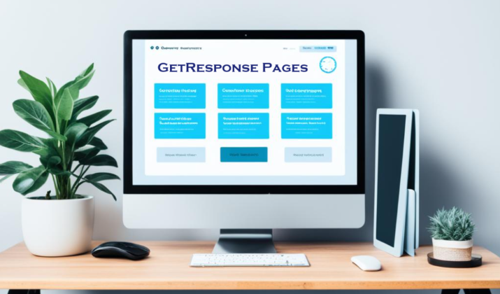
GetResponse, a leading email marketing and automation platform, offers a variety of customizable landing page templates that cater to different business needs.
In this article, we’ll explore some of the best examples of GetResponse landing pages that showcase innovative design, compelling content, and proven strategies for maximizing conversions.
Let’s dive in!
What is a Landing Page?
Before diving into the examples, let’s establish what a landing page is.
A landing page is defined as a specific webpage that visitors arrive at after clicking an advertisement or link. Its primary function focuses on converting visitors into leads or customers through methods such as capturing contact information in exchange for valuable content.
Essentially, a landing page is a standalone web page specifically designed for marketing campaigns, aiming to prompt a specific action from visitors.
As you explore the best GetResponse landing page examples, keep in mind how effective landing page designs can significantly impact your digital marketing efforts.
Also read: 10 Best GetResponse Alternatives
[lasso id=”18329″ link_id=”255205″ ref=”getresponse-special”]
Importance of Landing Pages
Landing pages play a crucial role in your digital marketing strategies.
They serve as the first point of contact between your business and potential customers, making it crucial to create a strong impression and guide visitors towards your desired action.
Here’s how landing pages benefit your business:
- Lead Generation: Landing pages are designed to capture leads by encouraging visitors to provide their contact information, such as an email address, in exchange for a valuable offer like a free ebook, webinar, or discount. By collecting these leads, you can nurture them through your sales funnel and convert them into paying customers.
- Targeted Messaging: Landing pages allow you to create targeted messaging that speaks directly to the needs and interests of your audience. By aligning your content with the specific campaign or ad that brought visitors to your page, you can increase relevance and improve the chances of conversion.
- Measurable Results: One of the biggest advantages of landing pages is their ability to provide measurable results. By tracking metrics such as bounce rate, conversion rate, and cost per lead, you can optimize your pages for better performance and make data-driven decisions about your marketing efforts.
- Improved User Experience: A well-designed landing page offers a seamless user experience that guides visitors through the conversion process. By eliminating distractions and providing a clear path to action, you can reduce friction and increase the likelihood of visitors completing your desired goal.
- Competitive Edge: By creating a unique and compelling offer that sets you apart from your competitors, you can attract more leads and drive more sales for your business.
Check out: GetResponse vs GoHighLevel
Characteristics of High-Converting Landing Pages

Creating a high-converting landing page is crucial for any digital marketing strategy. These pages are designed to turn visitors into leads or customers by encouraging them to take specific action.
Here are a few things to keep in mind when designing your landing pages:
1. Clear and Compelling Headline: The headline is the first element visitors see, making it essential to grab their attention immediately. It should clearly convey the unique value proposition and address the visitor’s needs or problems, setting the tone for the entire page.
2. Benefit-Focused Copy: The content should be concise and focused on the benefits of the offer. It should guide visitors toward the desired action by clearly explaining how the product or service will solve their problems or improve their situation.
3. Strong Visual Elements: High-converting landing pages utilize strong visual elements, such as relevant images or videos, to illustrate the offer. These visuals should complement the text and enhance the overall message, making the page more engaging.
4. Prominent Call-to-Action (CTA): A standout CTA is crucial for conversion. The button should be visually distinct, using contrasting colors and clear, action-oriented language like “Download Now” or “Get Started.” This encourages visitors to take immediate action.
5. Social Proof: Incorporating trust indicators, such as customer testimonials, reviews, or trust badges, can significantly enhance credibility. Social proof reassures visitors that others have benefited from the offer, making them more likely to convert.
6. Optimized Forms: Forms should be simple and optimized for conversions. Limiting the number of fields can reduce friction, making it easier for visitors to provide their information. Consider using a single-field form for email capture to maximize sign-ups.
7. Mobile Optimization: With a significant amount of web traffic coming from mobile devices, ensuring your landing page is mobile-friendly is essential. A responsive design that maintains usability across devices can improve user experience and conversion rates.
8. A/B Testing: Finally, regularly conducting A/B tests on various elements of the landing page—such as headlines, images, and CTAs—can help identify what resonates best with your audience. Continuous optimization based on performance data is key to maintaining high conversion rates.
By incorporating these characteristics, marketers can create landing pages that convert.
Explore: GetResponse vs Pardot
[lasso id=”18329″ link_id=”255206″ ref=”getresponse-special”]
Best Getresponse Landing Page Examples
Exploring top GetResponse landing pages can provide valuable insights into successful landing page designs.
These examples showcase a blend of creativity and strategy that elevates visitor engagement and conversion rates.
These designs from industry leaders offer practical inspiration from landing pages that you can implement into your own marketing efforts.
Here are the best GetResponse landing pages you can draw inspiration from:
1. Netflix
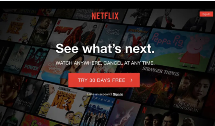
With over 150 million subscribers, Netflix has mastered the art of digital marketing, and a significant contributor to its success is its high-converting landing page.
One standout feature of Netflix’s landing page is its minimalistic design, which effectively conveys essential information without overwhelming the reader.
Here’s how they managed to accomplish it:
- Concise Copy: Only 12 compelling words are used to promote the service, effectively reassuring potential subscribers that signing up involves little risk.
- Engaging Imagery: The background showcases popular shows and movies, appealing to entertainment enthusiasts and reinforcing the vast content available.
- Irresistible Call-to-Action (CTA): The well-designed and strategically placed CTA button is visually appealing and encourages clicks, making it hard for visitors to resist.
- Streamlined User Journey: The landing page simplifies the sign-up process into an easy three-step journey, enhancing user experience and encouraging quick conversion.
With a minimalistic yet highly effective landing page, it’s no surprise that Netflix has experienced rapid growth and continues to attract new subscribers at a breakneck pace.
Read this too: GetResponse vs Hubspot
2. Uber
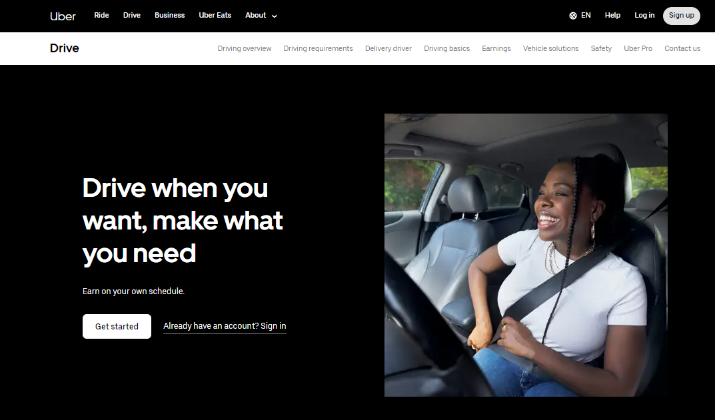
Uber, the ride-sharing giant, has mastered the art of creating high-converting landing pages that effectively capture the attention of potential drivers.
Their landing page serves as a prime example of how to design a compelling and conversion-focused page with powerful features such as:
- Clear and Concise Messaging: Uber’s landing page features a clean and straightforward design that immediately communicates the value proposition to visitors. The headline is direct and leaves no room for ambiguity about the purpose of the page. The copy that follows is concise, highlighting the key benefits of becoming an Uber driver, such as flexible hours and earning potential.
- Visually Appealing Graphics: The landing page utilizes visually appealing graphics that align with Uber’s brand identity. The black and white color scheme, which is consistent with Uber’s logo and branding, creates a cohesive and professional look. The font type used on the page is also the same as the one used in Uber’s app, further reinforcing brand recognition.
- Prominent Call-to-Action: Uber’s landing page prominently displays a call-to-action (CTA) button that encourages visitors to take the next step. The CTA is strategically placed at the end of the copy, making it easy for visitors to locate and click. The button’s color contrasts with the rest of the page, ensuring that it stands out and grabs the user’s attention.
- Streamlined User Experience: The landing page is designed to provide a seamless user experience, guiding visitors through the sign-up process. The layout is clean and uncluttered, with a clear hierarchy of information. Visitors can quickly scan the page, understand the benefits of becoming an Uber driver, and take action by clicking the CTA button.
- Conversion-Focused Design: Uber’s landing page is a prime example of conversion-focused design. Every element on the page, from the headline to the CTA button, is designed to encourage visitors to take the desired action. The page is optimized for conversions, with a clear value proposition, compelling benefits, and a prominent CTA that makes it easy for visitors to sign up.
As you can see, Uber has made the best of GetResponse’s landing pages to its advantage.
Also read: GetResponse vs ConvertKit
3. CoSchedule
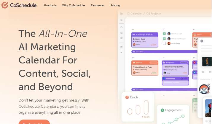
CoSchedule, a leading marketing calendar and project management platform, has crafted an exceptional landing page that effectively captures the attention of its target audience: overwhelmed marketers seeking to streamline their campaigns.
By leveraging GetResponse’s landing page templates, CoSchedule has created a page that exemplifies the power of hyper-targeted messaging and conversion-focused design.
- Hyper-Targeted Copy: One of the standout features of CoSchedule’s landing page is its hyper-targeted copy. The page clearly identifies its target audience – marketers struggling to keep all the moving pieces of their campaigns in one place – and addresses their pain points head-on. The copy positions CoSchedule as the solution these marketers have been waiting for, making it an irresistible offer.
- Compelling Headline: A great landing page headline is one that immediately tells visitors what to expect from the offer and makes them want to click through. CoSchedule’s headline does just that, cleverly conveying the value proposition in a concise and compelling manner. The headline extends into the call-to-action (CTA), reinforcing the solution CoSchedule provides.
- Sense of Urgency: Another noteworthy element of CoSchedule’s landing page is the way it infuses a sense of urgency into the offer. By including a time-limited promotion, such as a free book, the page encourages visitors who may be on the fence to sign up, even if it’s just for the bonus offer. This tactic increases the chances of conversion by creating a fear of missing out (FOMO).
- Minimalistic Design: CoSchedule’s landing page employs a clean and minimalistic design that keeps the focus on the key elements. The layout is uncluttered, with a clear hierarchy of information that guides visitors through the page. This approach ensures that visitors can quickly scan the page, understand the benefits of the product, and take action by clicking the CTA button.
The page is an excellent example of how to craft a targeted and conversion-focused landing page that sets a product apart in a crowded market.
Check out: GetResponse vs Shopify
[lasso id=”18329″ link_id=”255207″ ref=”getresponse-special”]
4. Workable

Workable, a leading applicant tracking system and recruiting software, has crafted a landing page that exemplifies the power of minimalist design.
It has created a page that effectively captures the attention of its target audience: busy HR managers and recruiters seeking an efficient way to manage their hiring process.
Here is a look at its key features:
- Minimalistic Design: One of the standout features of Workable’s landing page is its minimalistic approach.
The page employs a clean layout that keeps distractions to a minimum, allowing visitors to focus on the key elements. The use of white space creates a sense of clarity and organization, making it easy for users to navigate and understand the offer. - Benefit-Focused Copy: Workable’s landing page features concise and benefit-focused copy that clearly communicates the value proposition. The headline and subheadline are straightforward, highlighting the ease of use and efficiency of the platform. The bullet points that follow provide a quick overview of the key features, making it simple for visitors to understand how Workable can benefit their hiring process.
- Social Proof: To build trust and credibility, Workable’s landing page includes social proof in the form of customer logos and testimonials. By showcasing well-known brands that use their platform, Workable establishes itself as a trusted and reliable solution. The testimonials further reinforce this message, providing real-world examples of how Workable has helped other companies streamline their hiring efforts.
- Prominent Call-to-Action: Workable’s landing page features a prominent call-to-action (CTA) button that stands out against the minimalistic design. The button is strategically placed above the fold, making it easily accessible to visitors. The CTA copy, “Start Hiring Now,” is clear and action-oriented, encouraging users to take the next step in the conversion process.
- Mobile Optimization: Workable’s landing page is designed to be mobile-friendly, ensuring that visitors can access and engage with the content seamlessly on any device. The responsive design maintains a clean layout and readability across different screen sizes, making it easy for users to navigate and convert on the go.
The minimalistic design, benefit-focused copy, social proof, and prominent CTA work together to drive conversions and help HR managers and recruiters streamline their hiring process.
Explore: MailerLite vs GetResponse
5. Trello
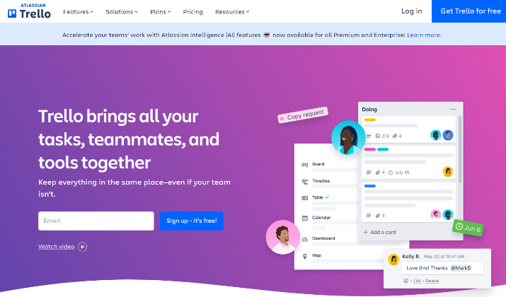
Trello, the popular project management and team collaboration tool, has crafted a landing page that exemplifies the power of effective communication and teamwork.
The landing page resonates with its target audience: professionals seeking an efficient way to manage projects and collaborate with their teams.
Here are some features that make it unique:
- Addressing Pain Points: The page acknowledges the challenges of team collaboration, especially in the context of remote work, which has become increasingly prevalent after the global pandemic. By directly addressing this issue, Trello positions itself as the solution to the problem, making it an attractive option for potential customers.
- Welcoming Design: Trello’s landing page evokes a sense of warmth and approachability with a clean, uncluttered layout and a color scheme that aligns with the brand’s identity. The use of friendly illustrations and a laid-back approach creates a welcoming atmosphere, making visitors feel at ease and encouraging them to explore the platform further.
- Minimalistic Approach: The landing page employs a minimalistic design with a copy that is concise and benefit-focused, highlighting the ease of use and collaborative nature of the platform. The layout is clean and organized, with a clear hierarchy of information that guides visitors through the page.
- Social Proof: To build trust and credibility, Trello’s landing page includes testimonials from satisfied customers. By showcasing real-world examples of how Trello has helped teams streamline their workflow and improve collaboration, the page establishes itself as a reliable and effective solution.
- Call-to-Action: Trello’s landing page features a prominent call-to-action (CTA) button that encourages visitors to sign up for the platform. The CTA is strategically placed above the fold, making it easily accessible to visitors. The copy on the button is clear and action-oriented, inviting users to take the next step in the conversion process.
Trello has created a highly effective landing page that resonates with its target audience and attracts new users to the platform.
Read this too: GetResponse vs Klaviyo
6. Whereby
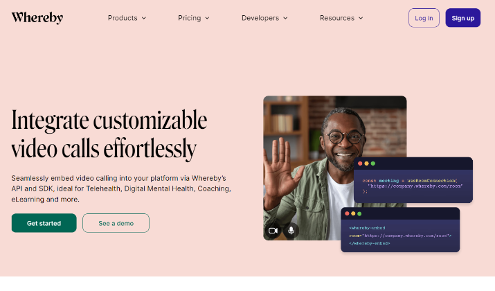
Whereby, the user-friendly video conferencing tool, has developed a landing page that stands out as an excellent example of a high-converting page using GetResponse’s templates.
The landing page effectively targets remote teams and businesses looking for a simple yet powerful solution for online meetings.
Its key features include:
- Clear Value Proposition: The headline succinctly communicates what the platform offers. This straightforward message immediately informs visitors about the core benefits of the service, making it easy for them to understand its purpose.
- Engaging Visuals: The landing page features vibrant images of people collaborating in a virtual environment, which not only showcases the product in action but also evokes a sense of connection and teamwork. This visual strategy helps potential users envision themselves using the platform for their own needs.
- Simple and Intuitive Design: The design of Whereby’s landing page is simple and intuitive, with an uncluttered layout and a clear hierarchy of information that guides users through the key features and benefits of the platform. This minimalistic approach ensures that visitors can quickly find the information they need without feeling overwhelmed.
- Strong call-to-action (CTA): The CTA that encourages visitors to sign up for a free trial is strategically placed and uses action-oriented language, such as “Start for free,” which motivates users to take immediate action. The contrasting color of the button makes it stand out, drawing attention and increasing the likelihood of clicks.
- Social Proof and Trust Indicators: To enhance credibility, Whereby’s landing page incorporates social proof in the form of testimonials and logos of well-known companies that use the service. This builds trust with potential customers by showing that reputable organizations rely on Whereby for their video conferencing needs.
- Focus on Benefits: The landing page effectively highlights the benefits of using Whereby, such as ease of use, no downloads required, and the ability to host meetings with up to 100 participants. By focusing on these key advantages, the page addresses the needs and concerns of potential users, making a compelling case for why they should choose Whereby over competitors.
Whereby has created a highly effective landing page with clear value proposition, engaging visuals, intuitive design, strong CTA, social proof, and focus on benefits.
All these contribute to its success in driving conversions and attracting new users to the platform.
Also read: GetResponse vs Builderall
[lasso id=”18329″ link_id=”255208″ ref=”getresponse-special”]
7. Slack
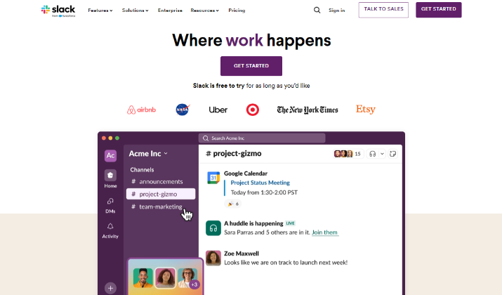
Slack, the popular workplace communication and collaboration tool, has crafted a landing page that exemplifies the power of minimalist design.
It has created a page that effectively captures the attention of its target audience: professionals seeking an efficient way to streamline their communication and boost productivity.
Its main features are as follows:
- Minimalistic Approach: The page employs a clean layout that keeps distractions to a minimum, allowing visitors to focus on the key elements. The use of white space creates a sense of clarity and organization, making it easy for users to navigate and understand the offer.
- Benefit-Focused Copy: Slack’s headline and subheadline are straightforward, highlighting the ease of use and efficiency of the platform. The bullet points that follow provide a quick overview of the key features, making it simple for visitors to understand how Slack can benefit their workflow.
- Engaging Visuals: To enhance the user experience, Slack’s landing page incorporates engaging screenshots that demonstrate the app’s functionality on both desktop and mobile devices. The use of vibrant colors and clean interfaces creates a visually appealing and professional look.
- Prominent Call-to-Action: Slack’s landing page features a prominent call-to-action (CTA) button that is strategically placed above the fold, making it easily accessible to visitors. The CTA copy, “Get Started,” is clear and action-oriented, encouraging users to take the next step in the conversion process.
- Social Proof: By showcasing well-known brands and organizations that use their platform, Slack establishes itself as a trusted and reliable solution. The testimonials further reinforce this message, providing real-world examples of how Slack has helped other companies streamline their communication and collaboration efforts.
Slack’s minimalistic design, benefit-focused copy, engaging visuals, prominent CTA, and social proof work together to drive conversions and help professionals streamline their communication and collaboration processes.
Check out: GetResponse vs Constant Contact
8. Snappr
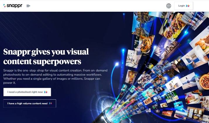
Snappr, a professional photography service, has designed a landing page that exemplifies effective marketing strategies using GetResponse’s templates.
This page effectively targets individuals and businesses looking for high-quality photography services, compellingly showcasing Snappr’s offerings.
The key features of this stunning landing page include:
- Clear Value Proposition: The headline immediately communicates the primary benefit of the service. This straightforward messaging resonates with visitors who are looking for quick and hassle-free photography solutions.
- Engaging Visuals: Snappr’s landing page utilizes stunning photographs that capture the essence of the brand, drawing visitors in and showcasing the type of work they can expect. This visual appeal is crucial for a photography service, as it directly reflects the quality of the product being offered.
- Benefit-Driven Copy: The copy on the landing page is concise and focused on key features such as easy booking, a wide range of photography styles, and competitive pricing. By outlining these advantages, Snappr effectively addresses potential customers’ needs and encourages them to take action.
- Prominent Call-to-Action: Snappr’s landing page features a prominent call-to-action (CTA) button that is strategically placed above the fold, making it easily accessible to users as soon as they land on the page. The button’s contrasting color ensures it stands out, drawing attention and prompting clicks.
- Social Proof and Trust Elements: To build credibility, Snappr’s landing page incorporates social proof in the form of customer testimonials and ratings. By showcasing positive feedback from satisfied clients, Snappr establishes trust with potential customers, making them more likely to proceed with booking a photographer.
- Streamlined User Experience: The design of Snappr’s landing page prioritizes user experience, with a clean layout that guides visitors through the key information. The use of bullet points and headings makes it easy for users to scan the content and find what they need quickly.
- Mobile Optimization: Understanding the importance of mobile accessibility, Snappr’s landing page is fully optimized for mobile devices. The responsive design ensures that users can easily navigate and engage with the content, regardless of the device they are using.
Snappr’s clear value proposition, engaging visuals, benefit-driven copy, prominent CTA, social proof, streamlined user experience, and mobile optimization contribute to enhanced conversions and attracting new clients to the platform.
Explore: GetResponse Free Trial
9. Miro
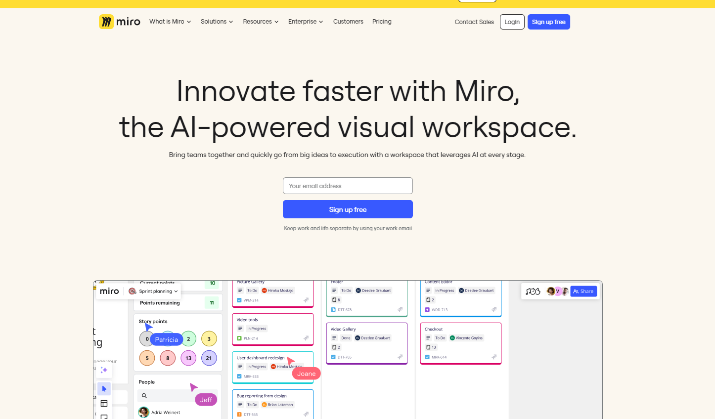
Miro, the online collaborative whiteboard platform, has designed a landing page that stands out as an excellent example of effective marketing using GetResponse’s templates.
This page effectively targets teams and individuals looking for a dynamic and interactive solution for brainstorming and project management.
- Eye-Catching Design: The use of round, chunky typography combined with bright colors creates a visually appealing experience that captures visitors’ attention. This colorful aesthetic not only reflects the creativity of the platform but also invites users to explore further.
- Clear Value Proposition: Miro’s landing page clearly communicates its ability to facilitate brainstorming and collaboration, making it immediately relevant to its target audience. This clarity helps potential users understand what Miro offers and how it can benefit their team.
- Interactive Elements: The landing page effectively utilizes interactive elements, including graphics and GIFs, to showcase the platform’s features. These visuals demonstrate Miro’s capabilities, such as real-time collaboration, online sticky notes, and mind mapping, allowing visitors to see the product in action.
- Benefit-Driven Copy: The copy on the landing page is concise and focused on the benefits of using Miro such as ease of use, flexibility, and the ability to work collaboratively from anywhere. By highlighting these advantages, Miro effectively addresses potential users’ needs and encourages them to take action.
- Prominent Call-to-Action: Miro’s landing page includes a prominent call-to-action (CTA) button that invites visitors to “Get Started.” The CTA is strategically placed and uses action-oriented language, making it clear what the next step is for users. The button’s contrasting color ensures it stands out, increasing the likelihood of clicks.
- Additional Resources: To further enhance user engagement, Miro’s landing page provides additional resources, including related templates and guides. This not only showcases the platform’s versatility but also reinforces Miro’s commitment to helping users maximize their experience.
- Social Proof: To build trust and credibility, Miro’s landing page incorporates testimonials and case studies from satisfied users. By showcasing real-world examples of how Miro has improved collaboration and productivity for teams, the page establishes confidence in potential customers, making them more likely to convert.
Read this too: Clickfunnels vs GetResponse
[lasso id=”18329″ link_id=”255209″ ref=”getresponse-special”]
10. Zapier
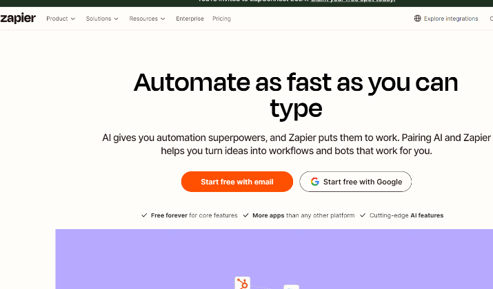
Zapier, the leading automation platform, has crafted a landing page that exemplifies the power of simplicity and functionality. Here are some of its features:
- Clear Value Proposition: The headline immediately communicates the primary benefit of the service. This concise messaging resonates with visitors who are looking for a solution to automate their repetitive tasks and connect their favorite apps.
- Benefit-Driven Copy: The copy on the landing page is focused on the benefits of using Zapier. It highlights key features such as easy setup, a wide range of app integrations, and the ability to save time. By outlining these advantages, Zapier effectively addresses potential customers’ needs and encourages them to take action.
- Prominent Call-to-Action: Zapier’s landing page features a prominent call-to-action (CTA) button that is strategically placed and uses action-oriented language, making it clear what the next step is for users. The button’s contrasting color ensures it stands out, increasing the likelihood of clicks.
- Streamlined User Experience: The design of Zapier’s landing page prioritizes user experience, with a clean layout that guides visitors through the key information. The use of bullet points and headings makes it easy for users to scan the content and find what they need quickly.
- Social Proof: To build trust and credibility, Zapier’s landing page incorporates social proof in the form of customer logos and testimonials. By showcasing well-known brands and organizations that use their platform, Zapier establishes itself as a trusted and reliable solution.
Zapier’s landing page with its clear value proposition, benefit-driven copy, prominent CTA, streamlined user experience, and social proof makes it stand out among its competitors.
Also read: GetResponse vs ActiveCampaign
Conclusion
So these are some of the best landing page examples you can take inspiration from to design your own. They demonstrate the diverse strategies that can be employed to achieve high conversion rates.
Key elements such as clear value propositions, engaging visuals, benefit-driven copy, prominent calls-to-action, social proof, and streamlined user experiences are critical components that contribute to the success of these landing pages.
Using these GetResponse’s templates, these brands have crafted pages that not only resonate with their target audiences but also drive meaningful engagement and conversions.
It’s time for you now to get started with GetResponse. Get it today!