
Think of a situation – you’re sitting in a meeting, trying to present your department’s quarterly performance to the team.
You’ve got the data ready—sales figures, customer trends, profit margins. But when you project your spreadsheet on the screen, the room goes silent.
The raw numbers are overwhelming, and you can feel your audience struggling to make sense of it all. You wonder, “How can I make this data come to life?”
That’s where Power BI dashboards come in.
A Power BI Dashboard is a single-page collection of visualizations that provides a concise overview of key metrics, allowing users to monitor business performance and make data-driven decisions effectively.
These dashboards are designed to turn complex data into visual stories that anyone can understand.
Whether you’re tracking sales, monitoring KPIs, or analyzing customer behavior, Power BI helps you transform raw numbers into actionable insights.
This guide will introduce you to 10 of the best Power BI dashboard examples, offering inspiration and ideas on how you can take your data presentations to the next level.
Take a look.
1. Sales Performance Dashboard
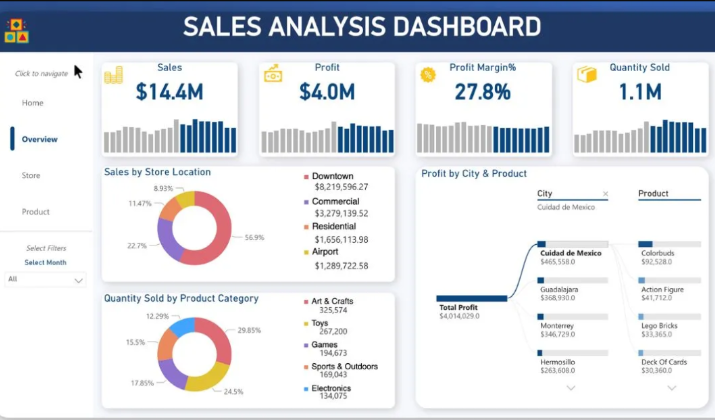
The Sales Performance Dashboard is designed for sales teams and managers to track their performance over time.
The dashboard typically includes metrics like total sales, sales by region, individual performance, and conversion rates.
It includes the following key metrics:
- Total Sales: The total revenue generated from sales
- Sales Growth: The percentage change in sales compared to a previous period
- Average Order Value: The average amount spent per order
- Conversion Rate: The percentage of leads that convert into customers
Visualizations
The dashboard utilizes various visualizations to present the data in an easy-to-understand format:
- Funnel Chart: Displays the sales funnel, showing the number of leads, opportunities, and won deals at each stage. This chart helps identify bottlenecks in the sales process.
- Scatter Plot: Compares sales representatives’ performance based on their total sales and conversion rate. This chart helps identify top-performing sales reps and those who may need additional support.
- Treemap: Shows the top-selling products or product categories. The size of each rectangle represents the total sales for that product or category.
- Map: Displays sales by geographical region, allowing users to identify high-performing and underperforming areas.
The Sales Performance Dashboard is an excellent example of how Power BI can be used to create a visually appealing, interactive, and informative dashboard that helps sales teams track their performance, identify areas for improvement, and make data-driven decisions to drive business growth.
Why It’s Effective: This dashboard is great for keeping your sales team motivated and on track. It gives everyone, from top executives to entry-level salespeople, a clear picture of how the company is performing.
2. Marketing Campaign Dashboard
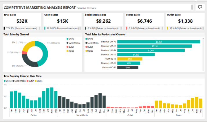
This dashboard is tailored to marketing teams looking to analyze the effectiveness of their campaigns. You’ll find metrics such as campaign reach, click-through rates, ROI, and customer acquisition costs.
It also helps you to:
- Track campaign performance across multiple channels (email, social media, paid ads).
- Visualize conversion funnels and click-through rates.
- Display ROI and customer acquisition costs.
- Analyze the success of different campaigns and strategies.
The Marketing Campaign Dashboard is a prime example of how Power BI can be effectively utilized to visualize and analyze marketing data.
With Comprehensive Financial Insights, the dashboard provides a clear overview of budget allocations and revenue generated from various marketing campaigns.
It allows users to track financial performance through visualizations like bar and line charts, which depict budget and revenue trends over time.
Another capability is Interactive Data Exploration. With functionalities such as slicers, users can filter data by different parameters like campaign type or target audience (B2B vs. B2C).
The interactivity enhances the user experience, allowing stakeholders to drill down into specific metrics such as conversion rates and ROI, thereby gaining actionable insights into how different strategies perform.
Why It’s Effective: With this dashboard, you can quickly see which marketing efforts are paying off and where you need to adjust your strategy. It’s a must-have for digital marketers who work across various platforms.
3. Customer Satisfaction Dashboard
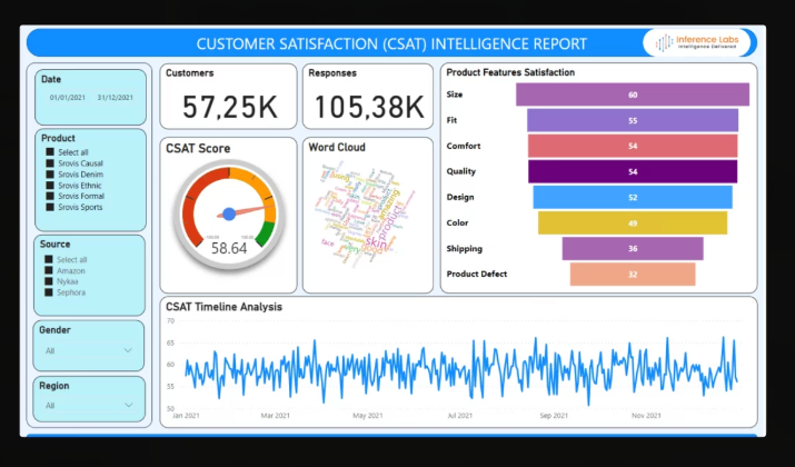
The Customer Satisfaction Dashboard is a standout example of a Power BI dashboard, designed to provide comprehensive insights into customer feedback and satisfaction levels.
This dashboard serves as a powerful analytical tool that helps businesses identify key trends and areas for improvement based on customer interactions.
Its key features are as follows:
- Visual Representation of Data: The dashboard utilizes various graphs and charts to display key performance indicators (KPIs) such as common complaints, product-specific issues, and customer sentiment. This visual approach makes it easy for stakeholders to grasp complex data quickly and effectively.
- Multi-Dimensional Analysis: It allows for analysis across different dimensions such as region, age, and gender, enabling businesses to tailor their strategies based on specific customer segments. This capability helps executives make informed decisions that enhance customer experiences and satisfaction.
- Real-Time Feedback Mechanism: The dashboard integrates multiple data sources, allowing businesses to monitor customer feedback in real time. It includes metrics like Customer Satisfaction Score (CSAT), Customer Effort Score (CES), and Net Promoter Score (NPS), providing a holistic view of customer sentiment and engagement.
By leveraging such a dashboard, organizations can not only track customer satisfaction but also implement actionable strategies to improve service delivery and overall customer experience.
Why It’s Effective: Understanding how your customers feel about your product or service is crucial. This dashboard helps you visualize that feedback in real time, making it easier to spot potential issues before they escalate.
4. CEO Dashboard
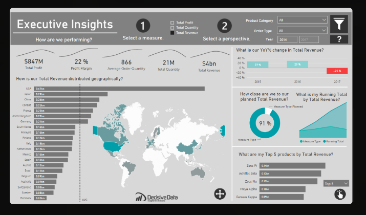
The CEO dashboard provides a high-level overview of the company’s overall performance, focusing on key performance indicators (KPIs) related to revenue growth, market share, and strategic initiatives.
It includes visual elements such as trend lines, heat maps, and scatter plots to highlight key trends and insights.
The CEO dashboard enables CEOs to monitor the company’s performance in real time, identify growth opportunities, and make informed strategic decisions.
It consolidates critical metrics from various departments, including:
- Financial Performance: Revenue, profit margins, return on investment (ROI), cash flow
- Sales and Marketing: Sales performance, customer acquisition cost, conversion rates, marketing campaign effectiveness
- Operations: Production efficiency, defect rate, inventory turnover, overall equipment effectiveness (OEE)
- Customer Experience: Customer satisfaction scores, Net Promoter Score, customer retention rates, customer lifetime value
By presenting these metrics in a visually compelling manner, the CEO dashboard empowers executives to quickly identify areas of concern or success and make data-driven decisions to drive growth and optimize operations.
The key features of an effective CEO dashboard include:
- Simplicity: Focusing on the most critical metrics without overwhelming the viewer
- Intuitive Visualizations: Using appropriate charts and graphs for easy interpretation of complex data
- Real-Time Data Updates: Providing current information for timely decision-making
- Accessibility: Ensuring the dashboard is responsive and user-friendly across multiple devices
By leveraging the power of Power BI, CEOs can gain a comprehensive understanding of their organization’s performance, enabling them to lead their companies to greater success.
Why It’s Effective: When executives need a quick, clear understanding of the company’s financial status, this dashboard provides the necessary insights at a glance, facilitating better decision-making.
5. HR Analytics Dashboard
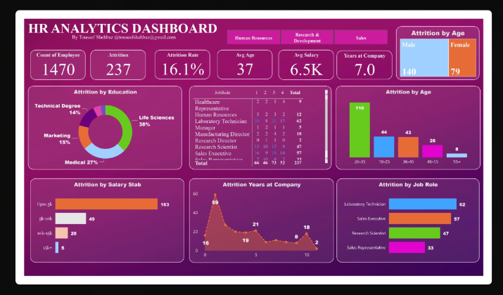
For HR professionals, this dashboard provides a visual overview of key employee metrics, such as employee turnover rates, recruitment efficiency, and diversity statistics.
Here are some of its features:
- Tracks employee turnover and retention rates
- Analyzes recruitment metrics (time to hire, cost per hire)
- Visualizes diversity and inclusion statistics
- Provides insights into employee performance and satisfaction
HR Analytics Dashboards serve as powerful tools for human resources departments. Here are two notable examples that illustrate their effectiveness:
- Strategic Personnel Resource Management: A Power BI HR Analytics Dashboard can provide HR teams with visual data to enhance decision-making in hiring, onboarding, and employee retention. By integrating demographic and geographic data, HR departments can ensure compliance with best practices and regulations, ultimately fostering a better work environment and potentially increasing productivity and profitability.
- Employee Performance and Attrition Analysis: Another example of a Power BI HR Dashboard focuses on monitoring key performance indicators (KPIs) related to employee demographics, hires, terminations, and open positions. The dashboard allows organizations to identify attrition risks and take preventative measures, ensuring that HR strategies are data-driven and effective in addressing workforce challenges.
These dashboards not only simplify complex data but also empower HR leaders to make informed decisions that positively impact the organization.
Why It’s Effective: This dashboard enables HR teams to keep a pulse on workforce trends and make data-driven decisions about hiring, retention, and employee engagement.
6. Call Center KPI Dashboard
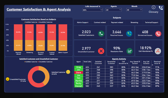
The Call Center KPI Dashboard serves as an exemplary model of a Power BI dashboard, effectively illustrating key performance indicators (KPIs) essential for call center management.
The dashboard allows managers to monitor crucial metrics such as call volume, abandonment rates, average wait times, and individual agent performance, all presented in user-friendly visual formats.
The key features include:
- Comprehensive Metrics: It displays vital statistics like the number of calls received, average handling times, and customer satisfaction scores, enabling quick assessments of operational efficiency and service quality.
- Interactive Visualizations: The dashboard utilizes various charts and graphs, allowing users to drill down into specific data points. This aids in identifying trends and areas needing improvement, facilitating data-driven decision-making.
Overall, the Call Center KPI Dashboard exemplifies how Power BI can be leveraged to enhance operational oversight and performance analysis in call centers.
Why It’s Effective: This dashboard provides real-time insights and visually engaging data representations, enabling swift decision-making and targeted improvements in call center operations.
7. Retail Analytics Dashboard
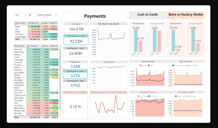
Retailers can use this dashboard to track key performance indicators like sales, inventory levels, customer behavior, and store performance.
This type of dashboard typically includes key performance indicators (KPIs) such as gross sales, profits, items sold, and shipping details, all presented through an intuitive and well-designed interface.
It helps you in:
- Tracking sales trends and customer buying patterns
- Analyzing inventory levels and product performance
- Monitoring store performance across locations
- Visualizing customer demographics and preferences
It allows users to analyze essential data across multiple dimensions, such as sales trends over time and product performance, facilitating data-driven decisions that can enhance business growth.
Moreover, the retail dashboard often features multiple pages that break down critical metrics into specific areas, such as sales, orders, and shipping, ensuring that stakeholders can quickly access the information they need to strategize effectively.
Why It’s Effective: By providing real-time insights into customer behavior and store performance, this dashboard helps retailers make informed decisions that can boost sales and optimize inventory management.
8. Supply Chain Dashboard
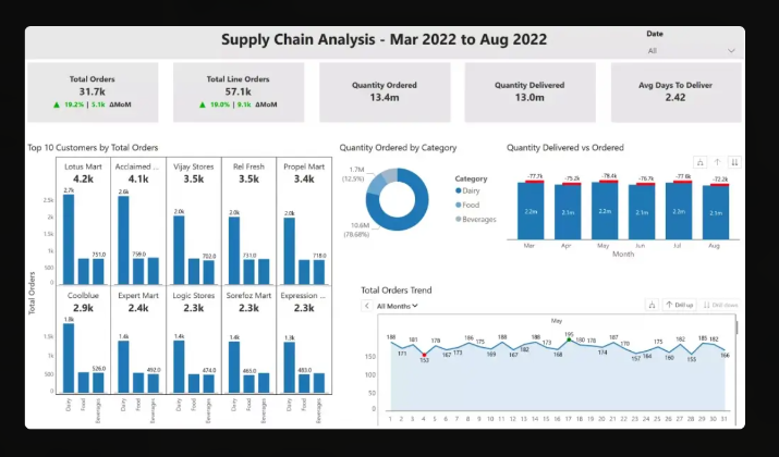
This dashboard is designed for supply chain managers to monitor the flow of goods, optimize logistics, and reduce costs.
It provides a clear visual of supply chain operations, from supplier performance to delivery times.
Some of its capabilities are as follows:
- Tracks supplier performance and on-time deliveries
- Monitors transportation costs and delivery times
- Analyzes inventory levels and stock turnover rates
- Visualizes bottlenecks and areas for cost reduction
The Power BI Supply Chain Dashboard is designed with a clean interface that presents data in an easily digestible format.
It includes visual elements like geo views and funnel charts to illustrate trends and performance across different regions and product lines.
The simplicity, combined with the ability to customize views and filter data, enhances usability for supply chain professionals, making it a powerful tool for strategic planning and operational management.
Why It’s Effective: Keeping the supply chain running smoothly is critical for any business, and this dashboard provides the insights needed to maintain efficiency and reduce operational costs.
9. Healthcare Dashboard
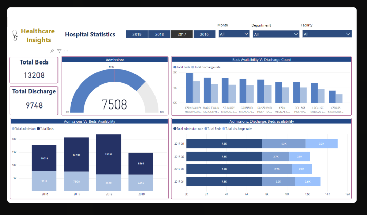
Healthcare administrators use this dashboard to track patient data, clinical performance, and resource utilization.
It helps in improving patient care and managing hospital operations. It offers numerous benefits that include:
- Visualizes patient admission and discharge rates
- Monitors clinical performance and patient outcomes
- Tracks resource utilization (staffing, equipment)
- Analyzes patient satisfaction and feedback
Types of Healthcare Dashboards
- Quality Performance Dashboard: Measures and tracks the quality of patient care, including metrics such as patient satisfaction, readmission rates, and adherence to clinical guidelines.
- Financial Dashboard: Provides insights into the financial health of the organization, including revenue, expenses, and profitability.
- Patient Experience Dashboard: Focuses on the patient’s journey, including metrics such as wait times, appointment scheduling, and patient satisfaction.
- Population Health Dashboard: Analyzes data related to the health of a specific population, enabling healthcare organizations to identify and address health disparities and social determinants of health.
- Operational Dashboard: Tracks key operational metrics, such as staffing levels, resource utilization, and process efficiency, to optimize workflows and improve productivity.
Why It’s Effective: Healthcare organizations need to monitor numerous aspects, from patient care to resource management. The dashboard consolidates that data for better decision-making and improved patient care.
10. Project Management Dashboard
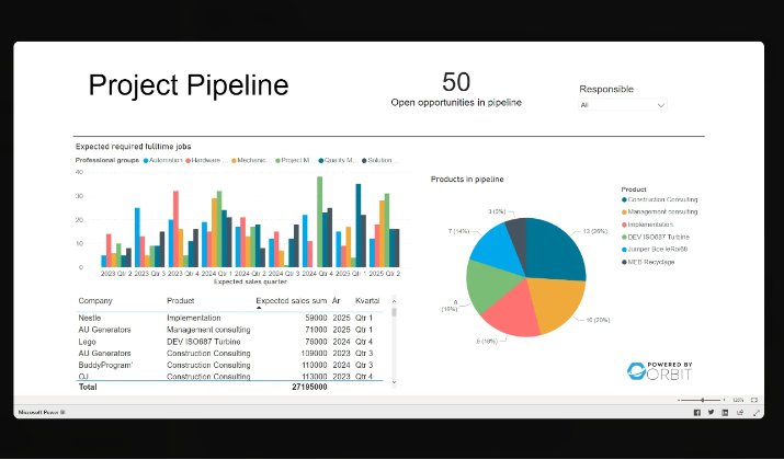
The Power BI Project Management Dashboard serves as an excellent example of how data visualization can enhance project oversight and resource allocation.
The dashboard is designed to provide a comprehensive view of project metrics, including:
- Project Status: Offers real-time updates on the current state of projects.
- Schedule Insight: Helps track timelines and deadlines.
- Cost Insight: Monitors budget adherence and financial performance.
- Resource Allocation: Displays available and billable resources, ensuring efficient utilization.
The dashboard effectively simplifies complex project data into clear visualizations, enabling project managers to make informed decisions quickly.
It offers the following features:
- Tracks project timelines and milestones
- Monitors budget performance and resource allocation
- Visualizes team performance and task completion rates
- Provides insights into project risks and bottlenecks
Why It’s Effective: By offering a real-time view of project progress, this dashboard helps managers stay organized, meet deadlines, and ensure that projects are delivered on time and within budget.
Conclusion
Power BI dashboards are more than just data visualizations—they’re a way to tell a story with your data.
Whether you’re tracking sales, managing a marketing campaign, or overseeing operations, the right dashboard can transform complex numbers into insights that drive better decisions.
The examples listed above are just the tip of the iceberg. As you explore Power BI, you’ll discover endless possibilities for customizing dashboards to fit your specific needs.
The key is to keep experimenting, fine-tuning, and finding creative ways to bring your data to life in a way that resonates with your audience.