Imagine you stumble across a sleek, engaging landing page while browsing online.
Intrigued, you find yourself seamlessly navigating through the content, appreciating how every element encourages you to take action.
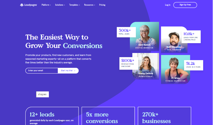
This moment encapsulates the power of effective landing pages, like those offered by Leadpages.
In this digital age, having a compelling landing page can make a significant difference in your lead generation efforts.
With Leadpages, creating mobile-responsive templates that can be quickly tailored to your needs is not just a possibility, but an accessible reality.
Throughout this article, you will explore diverse Leadpages website examples, showcasing how businesses harness these tools to convert visitors into loyal customers.
Whether you seek to build your email subscriber list with ebooks or host engaging webinars, Leadpages provides an array of pre-designed, conversion-optimized landing page templates tailored for various purposes.
Join us as we explore some of the best Leadpages website examples. This will give you that much-needed inspiration to build your own using Leadpages.
Understanding Leadpages
As a powerful landing page builder, Leadpages simplifies the creation of optimized pages that effectively capture leads.
Without requiring any coding skills, you can utilize its user-friendly interface and drag-and-drop functionality to design mobile-responsive pages tailored to your target audience.
Unlike traditional web pages, these landing pages lead visitors through a clear path, driving them deeper into the sales funnel.
They emphasize clarity with a well-defined call to action, which can include options like subscribing to newsletters or downloading valuable content.
Key Features
Leadpages offers outstanding features designed for effortless landing page creation.
- Drag-and-drop editor: One standout tool is the user-friendly drag-and-drop editor, allowing you to customize each element to suit your branding needs without requiring any coding skills. This intuitive design simplifies the process of building effective landing pages.
- Template library: Leadpages features over 200 templates tailored to various business objectives. These templates are mobile-responsive, ensuring optimal display across devices and enhancing user experience.
- Integration capabilities: The platform offers about 40 different integrations for analytics, email marketing, and CRM tools. This flexibility empowers you to connect your landing pages seamlessly with the systems you already use.
- Leadmeter: The Leadmeter feature assesses your landing pages against best practices, giving you valuable feedback for optimization.
With such features, creating beautiful, high-converting landing pages is only a matter of minutes.
Also read: 10 Cheapest Landing Page Builders
[lasso id=”21108″ link_id=”259817″ ref=”leadpages-special”]
Examples of Leadpages Websites
1. Plenty Vegan
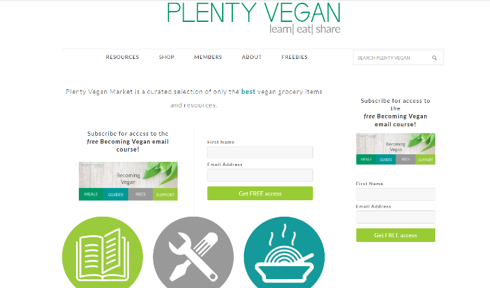
Plenty Vegan serves as an exemplary model of a successful Leadpages website, effectively combining appealing design with strategic functionality.
The landing page utilizes a harmonious color scheme of greens and whites, which reinforces its plant-based focus and creates a fresh, inviting atmosphere.
It balances text and icons well, making the information accessible and engaging for visitors. Each section features clear call-to-action (CTA) buttons that guide users toward desired actions, enhancing the conversion potential.
The thoughtful layout not only showcases the brand’s offerings but also ensures that potential customers are encouraged to interact and engage with the content, ultimately driving higher conversion rates.
Check out: Leadpages vs Kartra
2. SeeSharp
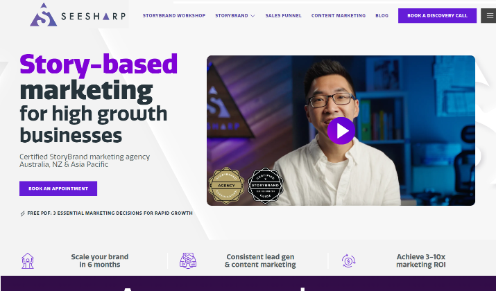
SeeSharp’s Leadpages website effectively utilizes bold calls-to-action to drive conversions. The landing page features prominent CTA buttons throughout, clearly inviting visitors to secure a spot.
Additionally, the page includes a “private invite” section for those unable to attend on the current date, giving potential customers a sense of exclusivity and importance.
The minimalist form field provides a quick and easy path to conversion, while the overall design keeps the focus on the main CTA.
The strategic elements work together to maximize the effectiveness of SeeSharp’s Leadpages website in generating leads and driving sign-ups.
Explore: 10 Best WordPress Landing Page Builders
3. The Weekend Woodworker
The Weekend Woodworker exemplifies an effective use of Leadpages by employing a streamlined, one-page design that enhances user experience and conversion rates.
This minimalist approach allows visitors to quickly grasp the offering without overwhelming them with information, making it ideal for those seeking straightforward solutions.
The landing page features a relatable image of the woodworker in his workshop, fostering a sense of connection with the audience.
Additionally, the clear and concise call-to-action encourages immediate engagement, effectively guiding potential customers toward signing up or learning more about the woodworking projects available.
The combination of relatability and simplicity makes The Weekend Woodworker a standout example of how to leverage Leadpages for optimal results.
Read this too: Leadpages vs OptimizePress
4. South Coast Inbound
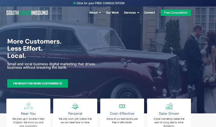
South Coast Inbound’s Leadpages website showcases a clean, modern design that effectively highlights its services and drives conversions.
The landing page features a prominent hero section with a clear value proposition and a strong call-to-action button, encouraging visitors to learn more about their inbound marketing solutions.
The use of icons and concise copy makes the content easily digestible, while the testimonials and client logos build trust and credibility.
The simple navigation menu allows users to quickly access relevant information, such as the services offered and the team behind the agency.
Overall, South Coast Inbound’s Leadpages website presents a professional and user-friendly experience that aligns with their brand and marketing goals.
Also read: Best Free Landing Page Builders For Affiliate Marketing
[lasso id=”21108″ link_id=”259818″ ref=”leadpages-special”]
5. Goalie Coaches
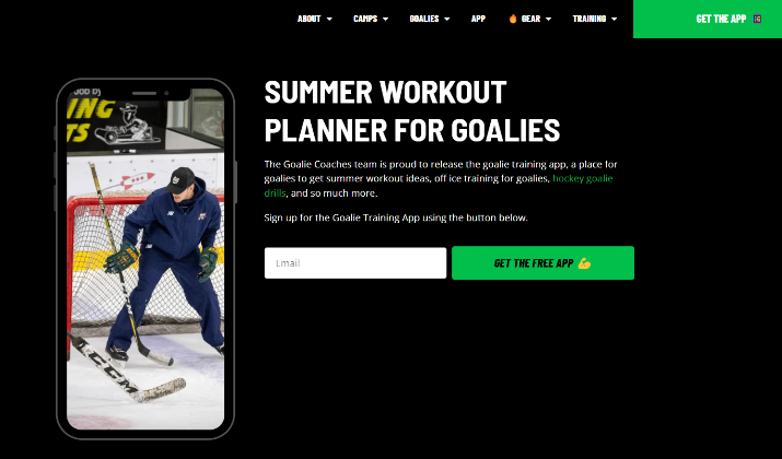
Goalie Coaches is an excellent example of a Leadpages. It has an engaging landing page that caters specifically to aspiring hockey goalies and their parents.
The site features a clean layout with eye-catching visuals that highlight the coaching services offered, making it easy for visitors to understand the value proposition.
Prominent call-to-action buttons encourage users to sign up for free consultations or workshops, facilitating lead generation.
Additionally, the integration of testimonials and success stories builds trust and credibility, reinforcing the effectiveness of their coaching programs.
Goalie Coaches effectively uses Leadpages to connect with its target audience and drive conversions through a user-friendly and visually appealing platform.
Check out: 10 Fastest Landing Page Builders
6. Dr. Jessica Higgins
Dr. Jessica Higgins exemplifies a well-crafted Leadpages website by effectively merging professional design with a clear focus on her coaching services.
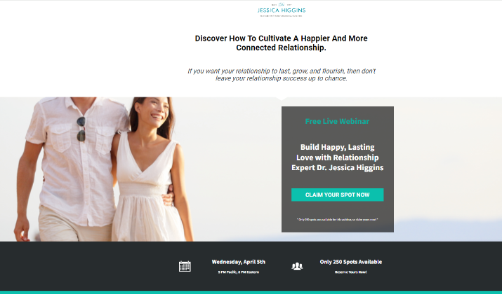
The landing page features a calming color palette and engaging visuals that resonate with her target audience, creating an inviting atmosphere for visitors seeking relationship guidance.
The call-to-action buttons stand out and encourage users to book consultations or access valuable resources, streamlining the conversion process.
The CTA that says “Only 250 spots available. Claim yours now!” effectively creates a sense of urgency and exclusivity.
Additionally, the inclusion of testimonials and success stories enhances credibility, showcasing the positive impact of her coaching.
Dr. Jessica Higgins’ Leadpages website successfully communicates her expertise while providing a user-friendly experience that drives engagement and leads.
Explore: Leadpages vs Kajabi
7. Poppy Sports
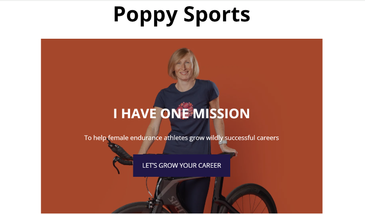
Poppy Sports stands out as an effective example of a Leadpages website by prioritizing clarity and simplicity in its design.
The landing page features a prominent call-to-action at the very top, ensuring that visitors immediately understand the purpose of the site and are encouraged to engage.
The straightforward layout minimizes text, which helps maintain user engagement and facilitates quick conversions.
By focusing on essential information and a smooth navigation experience, Poppy Sports successfully captures the interest of potential customers, making it easy for them to access swim workout challenges and training resources.
The approach not only enhances user experience but also maximizes the potential for lead generation.
Read this too: 10 Best Leadpages Alternatives
8. Maze Digital
Maze Digital is another outstanding example of Leadpages websites. It effectively showcases its digital marketing services through a visually appealing and user-friendly design.
The landing page features a strong value proposition at the top, immediately capturing the attention of visitors and clearly communicating the benefits of their offerings.
The strategic use of bold call-to-action buttons throughout the page encourages users to engage and explore further, facilitating lead generation.
Additionally, the integration of client testimonials and case studies enhances credibility, demonstrating the agency’s success and expertise in the field.
Maze Digital successfully utilizes Leadpages to create a compelling online presence that drives conversions and connects with potential clients.
Also read: 15 Easiest Landing Page Builders
[lasso id=”21108″ link_id=”259819″ ref=”leadpages-special”]
9. Career Contessa
Career Contessa caters to the needs of women seeking career advancement and job search guidance.
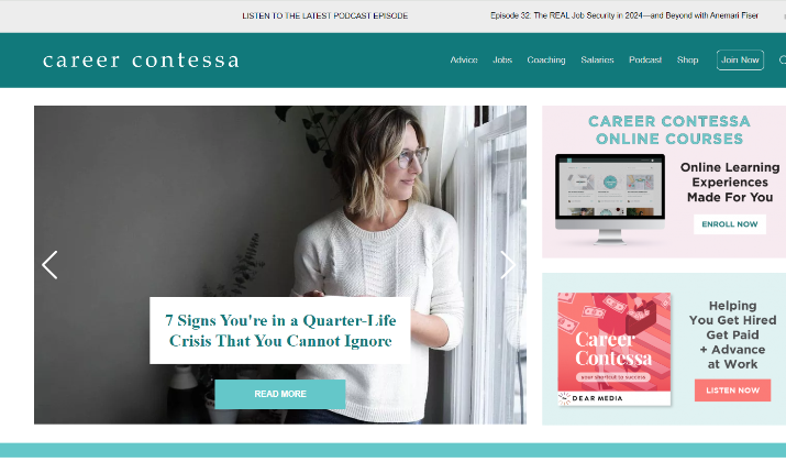
The landing page features a clean, modern design with a strong headline that clearly communicates the site’s purpose, instantly engaging visitors.
Prominent call-to-action buttons encourage users to access valuable resources, such as courses and webinars, which facilitate lead generation.
Additionally, the integration of testimonials and success stories enhances credibility, showcasing the positive impact of their services on users’ careers.
Using Leadpages, Career Contessa has created a supportive and informative platform that drives engagement and empowers women in their professional journeys.
Check out: Leadpages vs Clickfunnels
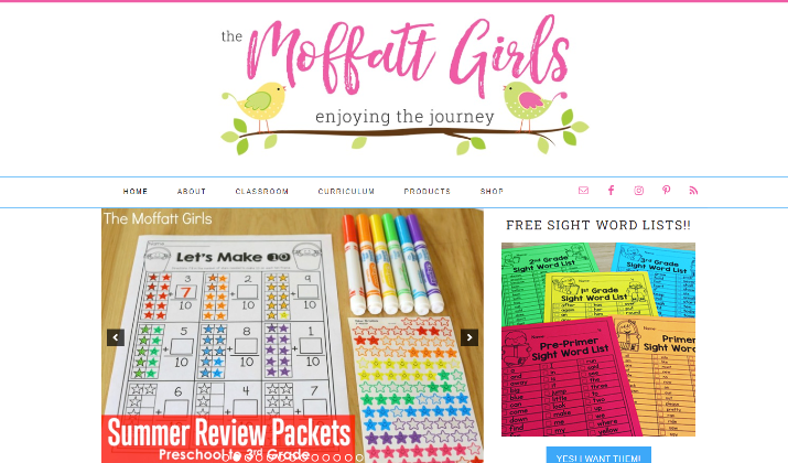
10. The Moffatt Girls
The Moffatt Girls creates a visually appealing and engaging subscription page that resonates with their target audience.
The landing page features a bright and inviting design, complemented by playful graphics that reflect the brand’s family-oriented focus.
A clear and concise messaging highlights the benefits of subscribing, while strategically placed call-to-action buttons encourage visitors to join their community.
The integration of testimonials and personal stories adds authenticity and builds trust, making potential subscribers feel connected to the brand.
The Moffatt Girls leverage Leadpages to create a user-friendly experience that effectively drives engagement and fosters a sense of belonging among their audience.
Explore: Leadpages vs Mailchimp
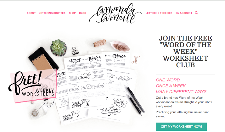
11. Amanda Arneill
Amanda Arneill effectively showcases her hand lettering services and resources in a visually appealing format.
The landing page features a bright and inviting design that captures the essence of her artistic brand, making it immediately engaging for visitors.
A punchy message clearly highlights the benefits of her offerings, such as workshops and downloadable resources, while strategically placed call-to-action buttons encourage users to take the next step, whether it’s signing up for a newsletter or purchasing a product.
Additionally, the integration of testimonials and examples of her work enhances credibility and fosters a connection with potential clients.
Amanda Arneill successfully utilizes Leadpages to create a user-friendly experience that drives engagement and conversions within her niche.
Read this too: Leadpages vs Squarespace
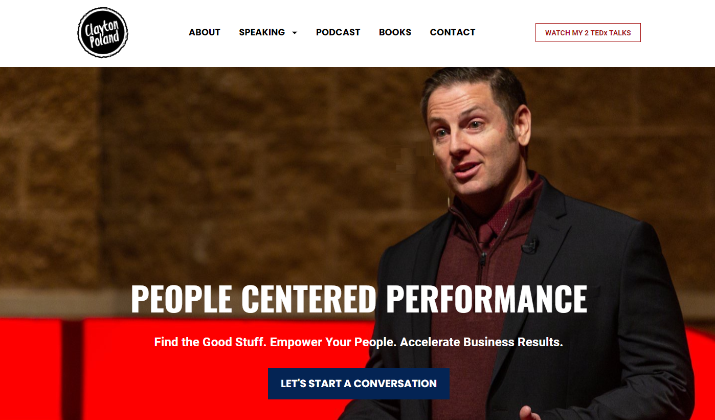
12. Clayton Poland
Clayton Poland effectively combines engaging storytelling with a clean, professional design that resonates with his audience.
The landing page prominently features his unique approach to inspiring others through ‘playful spirit, quick wit, and relatable storytelling’, immediately capturing visitors’ attention.
Well-designed call-to-action buttons guide users to explore the services, whether for speaking engagements or workshops, enhancing the likelihood of conversions.
The integration of personal anecdotes and testimonials adds authenticity and builds trust, allowing potential clients to connect with his message on a deeper level.
Clayton Poland’s use of Leadpages creates a compelling online presence effective enough to make an impression.
Also read: 10 Best ThriveCart Sales Page Templates
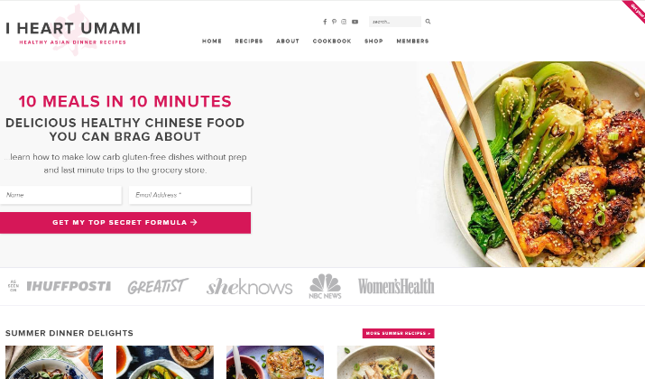
13. I Heart Umami
I Heart Umami features a visually appealing and user-friendly design that aligns with its brand identity.
The landing page features a clean layout with vibrant colors and high-quality images of the cookbook’s dishes, immediately capturing visitors’ attention and appetite.
Its simple and concise messaging highlights the benefits of the cookbook, while strategically placed call-to-action buttons encourage users to purchase or learn more.
The integration of customer testimonials and reviews enhances credibility and builds trust, making potential buyers feel confident in their decision.
Check out: Leadpages vs SamCart
14. Bills
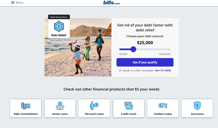
Bills serves is another Leadpages example communicating its value proposition and guiding visitors through a clear call-to-action.
The landing page features a prominent headline that directly addresses the pain point of debt, immediately capturing the attention of potential customers.
Use of a sliding tool on the right-hand side creates a personalized experience, engaging visitors and encouraging them to explore further.
The step-by-step process outlined below the main CTA removes uncertainty and makes it easy for users to get started on their path to becoming debt-free.
Additionally, the inclusion of social proof in the form of “Featured In” logos above the fold builds trust and credibility.
Overall, Bills’ Leadpages website successfully combines clear messaging, interactive elements, and strategic calls-to-action to drive conversions and help customers achieve their financial goals.
Explore: Hubspot vs Leadpages
[lasso id=”21108″ link_id=”259820″ ref=”leadpages-special”]
15. Belt Social
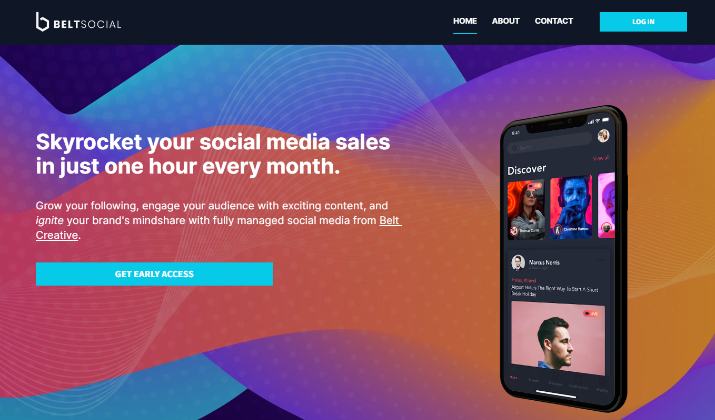
Belt Social stands out as a prime example of a Leadpages website by effectively showcasing its social media management services through a clean and visually appealing design.
The landing page features a prominent hero section with a clear value proposition and a strong call-to-action button, encouraging visitors to learn more about their offerings.
The use of icons and concise copy makes the content easily digestible, while the testimonials and client logos build trust and credibility.
A simple navigation menu allows users to quickly access relevant information, such as the services offered and the team behind the agency.
Belt Social’s Leadpages website presents a professional and user-friendly experience that aligns with their brand and marketing goals.
Read this too: Wishpond vs Leadpages
16. Yoga Branches
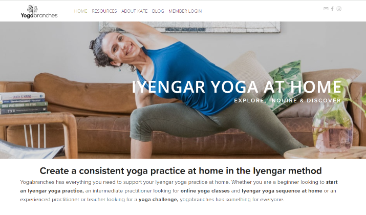
Yoga Branches provides a visually appealing and informative platform designed to engage yoga enthusiasts.
The landing page features a serene and inviting design that reflects the calming essence of yoga, immediately drawing in visitors.
Clear messaging highlights the benefits of the offered resources, such as actionable tips for consistent home practice, while strategically placed call-to-action buttons encourage users to sign up or download materials.
The incorporation of testimonials and user experiences adds credibility, fostering a sense of community among potential clients.
Also read: 15 Unbounce Landing Page Examples
17. Young Writer’s Workshop
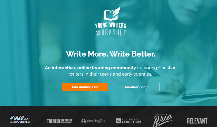
Young Writer’s Workshop effectively engages aspiring writers through a vibrant and user-friendly design.
The landing page features an inviting layout with bright colors and appealing visuals that resonate with the creative spirit of its audience.
A well-drafted messaging highlights the benefits of joining the workshop, while strategically placed call-to-action buttons encourage visitors to sign up for newsletters or enrol in courses.
The inclusion of testimonials from past participants adds credibility and fosters a sense of community, making potential customers feel more connected to the program.
Check out: Leadpages vs ConvertKit
18. Instant Teleseminar
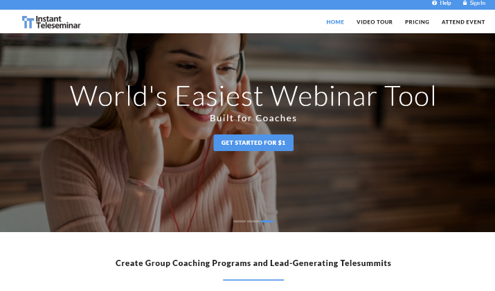
The Instant Teleseminar landing page features a compelling headline that highlights the platform’s key benefits, immediately capturing the interest of potential users.
The well-placed call-to-action buttons push visitors toward signing up for free trials or learning more about the features, facilitating lead generation.
The integration of customer testimonials and success stories adds credibility, demonstrating the platform’s effectiveness in enhancing online communication and engagement.
Explore: Leadpages vs Wix
Conclusion
These examples demonstrate the versatility and effectiveness of Leadpages in creating high-converting landing pages across various industries and niches.
From fitness and coaching to ecommerce and digital marketing, each website showcases how strategic design, clear messaging, and compelling calls-to-action can drive engagement and lead generation.
By prioritizing user experience, building trust through social proof, and guiding visitors toward desired actions, these Leadpages websites serve as models for businesses looking to optimize their online presence and achieve their marketing goals.

