Landing pages serve as critical touchpoints for businesses looking to convert visitors into customers.
A well-designed landing page can make all the difference in capturing leads, promoting products, and driving sales.
Unbounce, a leading platform for creating landing pages, empowers marketers and businesses to design high-converting pages without needing extensive coding skills.
Supported by a 14-day free trial, Unbounce allows you to design landing pages that capture attention through stunning visuals and compelling content.
In this article, we will explore some of the best examples of Unbounce landing pages that exemplify effective design, compelling content, and strategic calls to action.
From ecommerce brands to service-oriented businesses, these examples highlight how diverse industries leverage Unbounce to enhance their marketing efforts.
Whether you’re looking for inspiration for your next campaign or insights into best practices, these landing pages showcase the potential of well-crafted digital experiences.
Check them out.
1. Zola
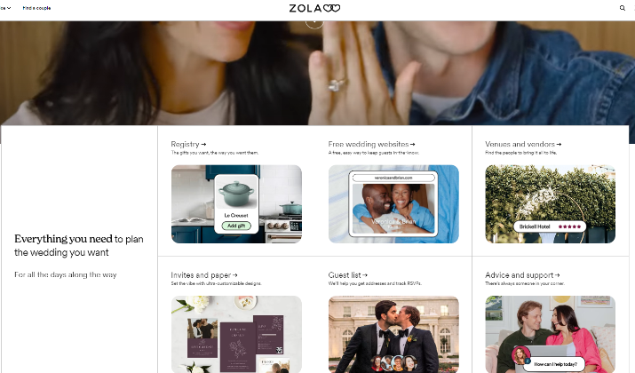
Zola, an innovative online wedding registry and planning service, stands out as an exemplary model of an Unbounce landing page.
The platform has successfully harnessed the power of Unbounce to create tailored landing pages that resonate with various audience segments, significantly enhancing user engagement and driving conversions.
Key Features
Zola’s landing page is meticulously designed to simplify the wedding planning process, offering a comprehensive suite of tools for couples. Here are some standout features:
- Visually Engaging Design: The page employs professional photography and a clean layout that showcases Zola’s offerings, including wedding invitations, registry options, and planning tools.
- Carousel of Design Examples: A dynamic carousel displays various invitation designs, allowing users to visualize their choices and encouraging interaction.
- Clear Calls to Action (CTAs): Strategically placed CTA buttons guide users towards key actions, such as starting a registry or exploring invitation options, enhancing the likelihood of conversion.
- Discount Offers: A sticky bar at the top of the page highlights ongoing discounts, creating a sense of urgency and incentivizing users to act quickly.
- Comprehensive FAQs: The inclusion of a FAQ section addresses common queries, helping to alleviate any concerns potential customers may have.
- Social Proof: Customer reviews and testimonials bolster credibility, reassuring visitors of the quality and reliability of Zola’s services.
To cater to its diverse clientele, Zola’s marketing team has developed over 300 unique landing pages, each tailored to specific audience segments.
The targeted approach allows Zola to connect with various types of visitors, from Pinterest users looking for wedding inspiration to couples interested in personalized registry options.
This strategic use of landing pages has yielded impressive results for Zola, with a substantial increase in conversion rates.
The insights gained from analyzing the performance of these landing pages have been instrumental in refining Zola’s overall website design and user experience.
Also read: Leadpages vs Unbounce
2. Cameo
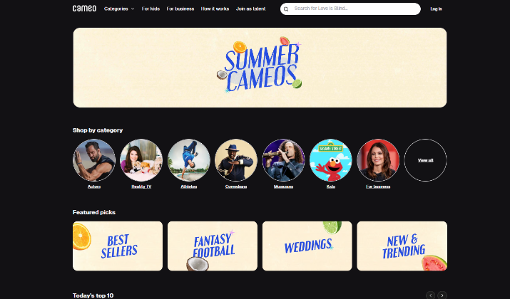
Cameo serves as an excellent example of an Unbounce landing page due to its effective design and user-centric approach, which successfully captures the essence of its unique service—personalized video shoutouts from celebrities, athletes, and influencers.
Key Features
- Clear Value Proposition: The landing page immediately communicates what Cameo offers—personalized messages from a diverse roster of talent. This clarity helps visitors quickly understand the service’s appeal.
- User-Friendly Process Explanation: To address any potential confusion, Cameo incorporates a straightforward three-step guide on how to use the service: browse talent, book a talent, and receive a video. This simplicity reinforces the ease of use, encouraging visitors to engage with the platform.
- Engaging Visuals: The landing page features vibrant images and videos of celebrities in action, which not only showcase the service but also evoke emotional responses from potential customers. For instance, videos of fans reacting to their personalized messages add a compelling layer of social proof.
- Humorous and Creative Examples: The page includes playful suggestions for using Cameo, such as having a celebrity deliver a birthday message, which sparks creativity and fun. This approach makes the service feel more relatable and accessible.
- High Click-Through Rates: According to insights from the designer, the landing page has achieved an impressive 85% click-through rate. This success can be attributed to the clear messaging and engaging design that keeps users interested.
Cameo’s landing page effectively utilizes Unbounce’s capabilities to create a focused and distraction-free environment.
By eliminating unnecessary elements and guiding users through the booking process, the page maximizes conversion potential.
The design is tailored to resonate with both casual users and those seeking unique gifts, broadening its appeal.
Check out: Leadpages vs Wix
[lasso id=”15797″ link_id=”255740″ ref=”unbounce-invitation”]
3. Drizzle Honey
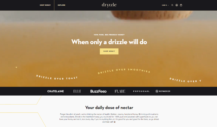
Drizzle Honey is a Canadian company that offers a premium selection of raw, unprocessed honey infused with superfoods to provide a delicious and nutritious sweetener option while supporting sustainable beekeeping practices.
It is an exemplary case of an effective Unbounce landing page, particularly for its focus on promoting the “Superfood Honey Collection” aimed at wholesale buyers.
Here are several reasons why this landing page stands out:
Key Features
- Vibrant Visuals: The landing page utilizes large, eye-catching images of their honey products, which immediately draw attention. This visual appeal not only showcases the product but also aligns with the brand’s identity, emphasizing the quality and natural essence of their offerings.
- Focused Messaging: Drizzle Honey effectively communicates its value proposition by highlighting the health benefits of its superfood ingredients. Each ingredient is detailed, explaining how it contributes to better health, which resonates with health-conscious consumers looking for natural products.
- Clean and Simple Design: The layout of the landing page is uncluttered, allowing visitors to focus on the primary call to action—placing a wholesale order. This simplicity reduces distractions and guides users toward conversion more effectively.
- Single Call to Action: The emphasis on a singular call to action encourages visitors to take the next step without confusion. This focused approach is crucial for driving conversions, as it creates a clear path for users to follow.
- Engaging Content: The page includes detailed descriptions of the products, including recipes and customer testimonials. This content not only informs potential buyers but also builds trust and credibility, which is essential for encouraging wholesale purchases.
- Responsive Design: Drizzle Honey’s landing page is optimized for various devices, ensuring that users have a seamless experience whether they are browsing on a desktop or mobile device. This adaptability is vital in today’s mobile-first world.
Drizzle Honey has crafted a landing page that effectively targets wholesale buyers. The strategic use of visuals, clear messaging, and a focused call to action aligns perfectly with the goals of the business, driving interest and facilitating conversions.
Drizzle Honey demonstrates how a well-designed Unbounce landing page can engage a target audience and drive sales.
Through vibrant visuals, clear communication of product benefits, and a streamlined user experience, Drizzle Honey successfully captures the essence of its brand while promoting its unique offerings.
Explore: Leadpages vs ConvertKit
4. GREATS
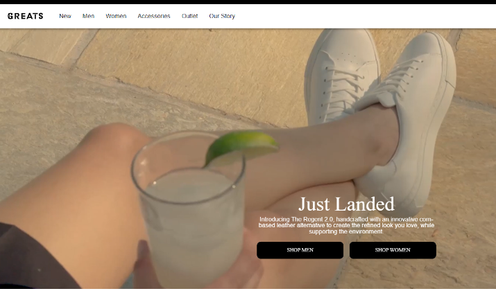
GREATS is a premium sneaker brand known for its stylish, high-quality footwear that combines classic designs with modern materials, emphasizing craftsmanship and sustainability in every pair.
It is recognized as a prime example of an effective Unbounce landing page due to its strategic design elements and focus on brand identity, which effectively drive conversions for its footwear products.
Key Features
- Strong Visual Appeal: The landing page features high-quality images and a sleek design that aligns with the brand’s aesthetic. The visuals are not only attractive but also showcase the products in a way that resonates with the target audience, emphasizing style and quality.
- Engaging Video Content: A standout feature of GREATS’ landing page is the use of a captivating stop-motion video that illustrates the craftsmanship of their footwear. This dynamic element not only grabs attention but also effectively communicates the brand’s unique selling proposition—quality and authenticity—by showcasing the product’s details in an engaging format.
- Clear Messaging: The landing page employs concise and impactful messaging that highlights the benefits of the products. By using the “rule of threes,” GREATS presents key benefits in a visually striking and easily digestible manner, making it simple for visitors to understand what sets their products apart.
- Focused Call to Action: GREATS strategically places prominent calls to action (CTAs) throughout the page, guiding visitors toward making a purchase. This clear direction helps to minimize confusion and enhances the likelihood of conversion.
- Brand Consistency: The overall design and messaging are consistent with GREATS’ brand identity, which emphasizes authenticity and quality. This coherence helps to build trust with potential customers, reinforcing the brand’s image as a premium footwear provider.
GREATS has created a landing page that is not only visually appealing but also highly functional. The combination of engaging visuals, clear messaging, and strategic CTAs ensures that visitors are effectively guided toward making a purchase, enhancing the overall user experience.
Using strong visual elements, engaging content, and clear calls to action, GREATS successfully captures the attention of potential customers, making it a standout example in the realm of digital marketing.
Read this too: Leadpages vs WordPress
5. Indochino
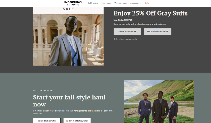
Indochino is a leading made-to-measure apparel company that revolutionizes the way consumers purchase custom suits, offering a personalized shopping experience tailored to individual preferences.
It is hailed as a good example of an Unbounce landing page due to its innovative design and strategic use of features that effectively drive conversions.
Here are the key features that contribute to its success:
Key Features
- Editorial-Style Content: Indochino created landing pages that resemble editorial articles rather than traditional sales pages. This approach attracted significant traffic and led to a conversion rate of 17.40%, effectively engaging visitors with informative content that aligns with their interests.
- Location-Specific Targeting: The company utilized Unbounce to create landing pages tailored to specific locations where new showrooms were opening. This personalization resonated with users, resulting in a conversion rate of 19.38% for location-targeted pages, as visitors felt the content was directly relevant to them.
- Quick Page Creation: Indochino leveraged Unbounce’s capabilities to rapidly develop landing pages for various campaigns and partnerships. This speed allowed them to capitalize on marketing opportunities without lengthy development times, ensuring timely promotions.
- Strong Visuals: The landing pages feature high-quality images of Indochino’s tailored suits, effectively showcasing the product in an appealing manner. This visual strategy enhances the overall user experience and reinforces the brand’s premium positioning.
- Focused Calls to Action (CTAs): Indochino’s landing pages include prominent CTAs that guide users toward desired actions, such as booking appointments or exploring products. This clear direction minimizes confusion and encourages conversions.
- Brand Consistency: The design elements, including fonts and color schemes, are consistent with Indochino’s brand identity. This coherence helps build trust and recognition among visitors, reinforcing the brand’s image as a leader in made-to-measure apparel.
- Performance Tracking: Indochino utilizes Unbounce’s analytics features to monitor the performance of their landing pages. This data-driven approach allows them to optimize their strategies continually and improve conversion rates over time.
Indochino engages users and drives conversions through innovative content, targeted messaging, and strong visual appeal.
These features combine to create a compelling user experience that aligns with the brand’s goals and audience.
Also read: Leadpages vs Landingi
[lasso id=”15797″ link_id=”255741″ ref=”unbounce-invitation”]
6. Later
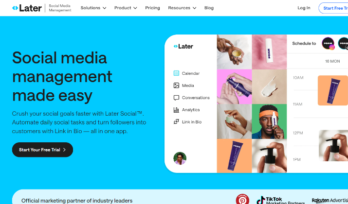
Later is a powerful social media scheduling platform that helps users plan and optimize their content across various channels, enhancing their social media marketing efforts.
Here are the key features of the page:
Key Features
- Editorial-Style Content: Indochino created landing pages that resemble editorial articles rather than traditional sales pages. This approach attracted significant traffic and led to a conversion rate of 17.40%, effectively engaging visitors with informative content that aligns with their interests.
- Location-Specific Targeting: The company utilized Unbounce to create landing pages tailored to specific locations where new showrooms were opening. This personalization resonated with users, resulting in a conversion rate of 19.38% for location-targeted pages, as visitors felt the content was directly relevant to them.
- Quick Page Creation: Indochino leveraged Unbounce’s capabilities to rapidly develop landing pages for various campaigns and partnerships. This speed allowed them to capitalize on marketing opportunities without lengthy development times, ensuring timely promotions.
- Strong Visuals: The landing pages feature high-quality images of Indochino’s tailored suits, effectively showcasing the product in an appealing manner. This visual strategy enhances the overall user experience and reinforces the brand’s premium positioning.
- Focused Calls to Action (CTAs): Indochino’s landing pages include prominent CTAs that guide users toward desired actions, such as booking appointments or exploring products. This clear direction minimizes confusion and encourages conversions.
- Brand Consistency: The design elements, including fonts and color schemes, are consistent with Indochino’s brand identity. This coherence helps build trust and recognition among visitors, reinforcing the brand’s image as a leader in made-to-measure apparel.
- Performance Tracking: Indochino utilizes Unbounce’s analytics features to monitor the performance of their landing pages. This data-driven approach allows them to optimize their strategies continually and improve conversion rates over time.
Indochino drives conversions through innovative content, targeted messaging, and strong visual appeal.
Its features combine to create a compelling user experience that aligns with the brand’s goals and audience expectations.
Check out: 10 Best GetResponse Landing Page Examples
7. Procurify
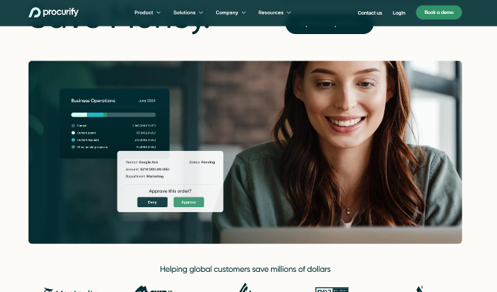
Procurify is a spend management software company that leverages innovative account-based marketing strategies to connect directly with target customers through personalized landing pages.
It is hailed as a good example of an Unbounce landing page due to its innovative approach to account-based marketing (ABM) and its effective use of personalized landing pages.
Here are the key reasons why Procurify stands out:
Key Features
- Personalized Landing Pages: Procurify created tailored landing pages for each of the 50 target accounts identified in their ABM strategy. Each page included the prospect’s name and company logo, making the experience highly personalized and relevant.
- Rapid Deployment: The marketing team was able to build all 50 personalized landing pages in just one day using Unbounce. This speed allowed them to respond quickly to marketing opportunities and maintain momentum in their campaigns.
- Branded Templates: Procurify developed a library of branded templates within Unbounce, enabling team members to create on-brand, campaign-specific landing pages independently. This feature promotes efficiency and consistency across marketing efforts.
- Integration with Marketing Tech Stack: Unbounce seamlessly integrates with Procurify’s existing marketing technology, making it easier to manage campaigns and track performance without disrupting their workflow.
- Focus on Independence: By empowering the marketing team to create and modify landing pages without relying on a designer, Procurify fosters a culture of independence. This agility allows them to launch campaigns quickly and adapt to changing needs.
- Effective Use of ABM: The combination of direct mail with personalized landing pages exemplifies a creative and effective ABM strategy. The integration of custom swag boxes that directed recipients to the landing pages enhanced engagement and conversion potential.
- Clear Calls to Action: Each landing page includes strong calls to action that guide prospects toward connecting with specific members of the Procurify sales team, facilitating the next steps in the sales process.
Procurify’s strategic use of Unbounce for personalized landing pages, rapid deployment, and integration with their marketing stack showcases how effective landing page design can enhance account-based marketing efforts and drive conversions.
Explore: Leadpages vs Instapage
8. Shoelace
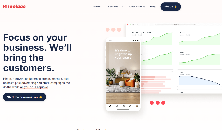
Shoelace is a growth marketing agency that specializes in managing paid marketing campaigns and implementing strategies to help brands scale across various digital channels.
Here is what makes the Shoelace landing page special.
Key Features
- Pop Art Design: The landing page features vibrant, on-brand illustrations and animations that create a visually appealing experience, capturing the attention of visitors immediately.
- Engaging Copy: The copy effectively emphasizes the problems Shoelace addresses and introduces a downloadable resource as a fun and attractive solution, making it relatable and engaging for potential customers.
- Clear Call to Action (CTA): The page includes a prominent primary CTA that encourages users to download the resource, along with a secondary option to “book a demo,” catering to visitors who may already be familiar with the service.
- User-Centric Approach: By addressing the specific needs and pain points of its target audience, Shoelace creates a connection with visitors, increasing the likelihood of conversion.
- Responsive Design: The landing page is optimized for various devices, ensuring a seamless experience for users regardless of how they access the site, which is crucial in today’s mobile-first environment.
- Social Proof: While not explicitly detailed in the search results, effective landing pages often incorporate testimonials or case studies to build trust, and Shoelace likely follows this practice to enhance credibility.
Read this too: Beaver Builder vs Divi
9. Mixmax
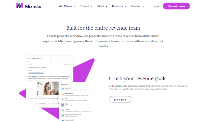
Mixmax is an email tracking and marketing automation tool designed to enhance productivity for sales teams and business owners by allowing them to send, schedule, and analyze emails directly from their Gmail or G Suite accounts.
Key Features
- Customer-Centric Headlines: The landing page focuses on the visitor’s needs rather than just the product features, making it relatable and engaging for potential users.
- Engaging Copy: The text is tailored to speak directly to users, using phrases like “De-clutter YOUR email” and “Automate YOUR day,” which resonate with their pain points and encourage action.
- Benefits Highlighted: The page clearly outlines the advantages of using Mixmax, emphasizing how the platform solves specific problems for users, which helps in decision-making.
- Resonant Framing: By adopting a visitor-oriented approach, Mixmax establishes a strong connection with its audience, enhancing the likelihood of conversion.
- Clean and Focused Design: The layout is uncluttered, allowing users to focus on the key messages and CTAs without distractions, which is crucial for effective conversion.
- Strong Calls to Action (CTAs): The landing page features prominent CTAs that guide users toward signing up or trying the service, making it easy for visitors to take the next step.
Mixmax focuses on customer-focused messaging, clear benefits, and a clean design to create high-performing landing pages that resonate with target audiences.
Also read: Genesis Framework vs Divi
[lasso id=”15797″ link_id=”255742″ ref=”unbounce-invitation”]
10. Thinkific
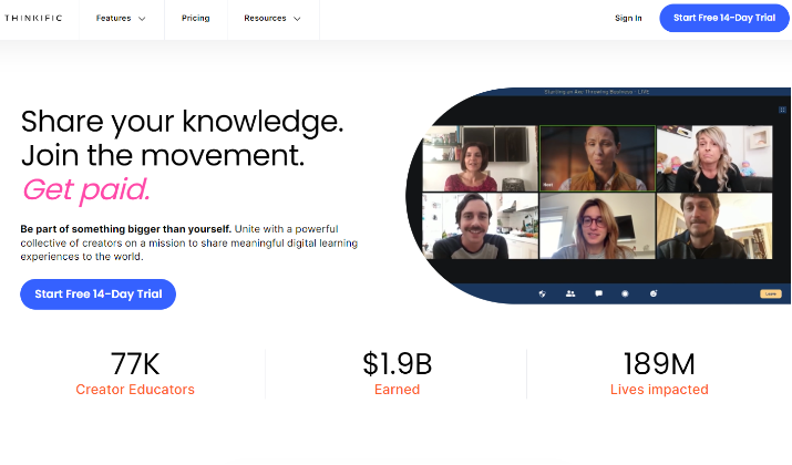
Thinkific is an online platform that allows users to create, market, and sell their own online courses.
It is hailed as a good example of an Unbounce landing page due to its effective design and strategic focus on driving conversions for its online course platform.
Key Features
- Clear Value Proposition: The landing page effectively communicates the benefits of using Thinkific for creating and selling online courses, making it immediately clear to visitors what they can gain from the platform.
- Engaging Visuals: Thinkific utilizes high-quality images and a clean layout that captures attention and enhances the user experience, showcasing the platform’s features and user interface.
- Strong Calls to Action (CTAs): The page includes prominent and compelling CTAs that encourage visitors to sign up or start a free trial, guiding them toward taking action without confusion.
- Social Proof: Incorporating testimonials and success stories from existing users helps build credibility and trust, reassuring potential customers about the platform’s effectiveness.
- Focus on User Needs: The landing page addresses common pain points faced by course creators, positioning Thinkific as a solution that simplifies the process of launching and managing online courses.
- Responsive Design: The landing page is optimized for both desktop and mobile devices, ensuring that users have a seamless experience regardless of how they access the site.
- Educational Content: Thinkific often includes resources such as guides or webinars on the landing page, providing additional value to visitors and establishing the brand as an authority in the online education space.
Thinkific drives conversions through clear messaging, strong visuals, and a focus on user needs.
Check out: 17 Best Divi Theme Examples
11. Western Rise
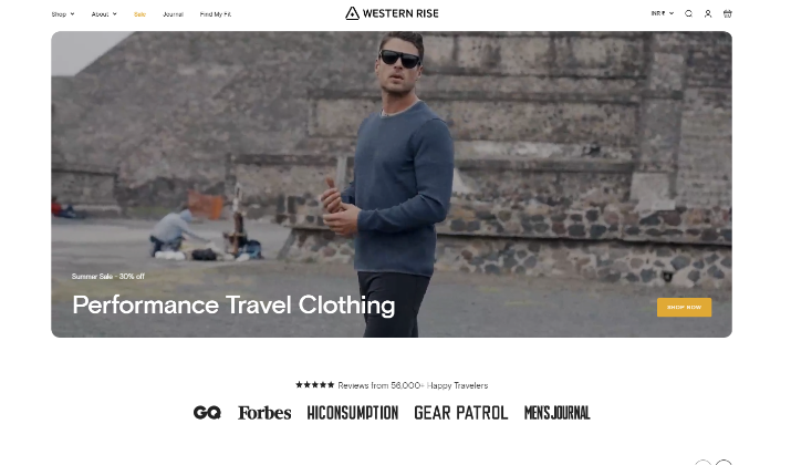
Western Rise is an outdoor apparel brand that specializes in versatile, high-quality clothing designed for travel and adventure.
Its stunning visuals and effective design is a crucial factor that drives conversions for its outdoor apparel products.
Key Features
- Clear Value Proposition: The landing page communicates the brand’s commitment to high-quality, versatile outdoor clothing, making it clear to visitors what they can expect from the products.
- Engaging Visuals: Western Rise uses high-quality images and videos that showcase their apparel in action, appealing to outdoor enthusiasts and enhancing the overall aesthetic of the page.
- Strong Calls to Action (CTAs): The page features prominent CTAs that encourage visitors to shop now or learn more about specific products, guiding users toward taking action.
- User-Centric Messaging: The copy addresses the needs and desires of the target audience, emphasizing comfort, functionality, and style, which resonates with potential customers looking for outdoor gear.
- Social Proof: The inclusion of customer testimonials and reviews helps build trust and credibility, reassuring potential buyers about the quality and performance of the products.
- Responsive Design: The landing page is optimized for both desktop and mobile devices, ensuring a seamless user experience regardless of how visitors access the site.
- Educational Content: Western Rise often incorporates informative content about the materials and technology used in their products, helping customers understand the benefits and making informed purchasing decisions.
Western Rise’s strategic use of engaging landing pages and marketing tactics further enhances its appeal, making it a prime example of how to effectively connect with a target audience and drive conversions.
Explore: Divi vs Gutenberg
12. Wavehuggers
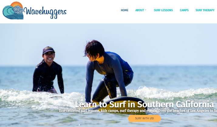
Wavehuggers is a surfing school that offers lessons and experiences for individuals looking to learn how to surf or improve their skills. It has a stunningly designed landing page with powerful features.
Key Features
- Clear and Compelling Value Proposition: The landing page effectively communicates the unique benefits of Wavehuggers’ products, making it immediately clear to visitors what they can gain.
- Engaging Visuals: High-quality images and vibrant colors are used to capture attention and showcase the products, enhancing the overall aesthetic of the page.
- Strong Calls to Action (CTAs): The page features prominent CTAs that encourage visitors to take specific actions, such as signing up for offers or purchasing products, guiding users toward conversion.
- User-Friendly Design: The layout is clean and intuitive, allowing visitors to navigate easily and focus on the key messages without distractions.
- Social Proof: Incorporating customer testimonials and reviews helps build trust and credibility, reassuring potential buyers about the quality and effectiveness of the products.
- Mobile Optimization: The landing page is designed to be responsive, ensuring a seamless experience for users on both desktop and mobile devices, which is crucial for maximizing conversions.
- A/B Testing Capabilities: Wavehuggers can utilize Unbounce’s A/B testing features to optimize the landing page continuously, testing different elements to improve performance and conversion rates.
By leveraging Unbounce’s features like drag-and-drop customization, mobile optimization, and A/B testing, Wavehuggers is able to create a landing page that clearly communicates its value proposition.
It showcases vibrant visuals of surfing experiences, and prominently features strong calls-to-action to book lessons.
Read this too: 10 Best GetResponse Alternatives
13. SnackNation
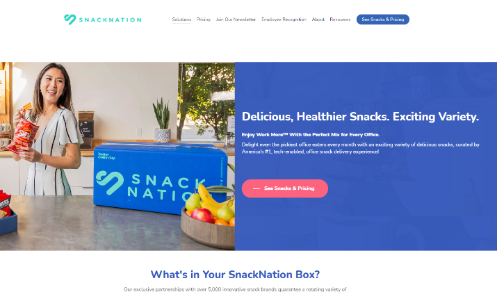
SnackNation is a subscription-based snack delivery service that provides a curated selection of healthy snacks to offices and homes.
It is considered a good example of an Unbounce landing page due to its effective use of design and marketing strategies that drive user engagement and conversions.
Key Features
- Targeted Messaging: SnackNation’s landing page clearly communicates its value proposition as a snack delivery service, emphasizing convenience and quality, which resonates with busy professionals and teams.
- Engaging Visuals: The use of vibrant images showcasing the snacks creates an appealing visual experience that captures the attention of visitors and highlights the product offerings.
- Strong Calls to Action (CTAs): The landing page features prominent CTAs that encourage visitors to subscribe or learn more about the service, guiding users toward conversion effectively.
- Popup Form for Lead Generation: SnackNation employs a custom popup form to promote special offers, which captures leads and encourages subscriptions without disrupting the user experience.
- User-Friendly Design: The layout is clean and intuitive, allowing visitors to navigate easily and focus on the key messages without distractions, enhancing the likelihood of conversion.
- Social Proof: Incorporating testimonials and reviews from satisfied customers helps build trust and credibility, reassuring potential subscribers about the quality and reliability of the service.
- Responsive Design: The landing page is optimized for both desktop and mobile devices, ensuring a seamless experience for users regardless of how they access the site.
SnackNation’s landing page is designed to capture the attention of potential subscribers by prominently showcasing the benefits of their healthy snack delivery service.
With a clean layout and intuitive navigation, visitors can easily find information and are encouraged to take action through compelling CTAs.
Also read: Divi Theme Coupon Code
[lasso id=”15797″ link_id=”255743″ ref=”unbounce-invitation”]
14. Perfect Keto
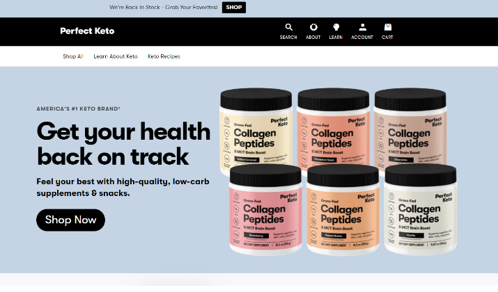
Perfect Keto is an ecommerce brand that specializes in offering a range of keto-friendly products, including snacks, supplements, and meal replacements designed for individuals following a ketogenic diet.
Key Features
- Targeted Messaging: The landing page focuses specifically on Perfect Keto’s protein bars, clearly communicating their benefits to individuals following a ketogenic diet. This targeted approach helps attract the right audience.
- Strong Social Proof: The “Trusted by Health Leaders” section prominently displays numerous reviews and endorsements from experts in the health and wellness industry. This builds trust and reassures potential customers about the quality of the products.
- User Identification: The section titled “Keto bars are perfect for…” allows visitors to quickly see how the bars fit into their lifestyle, whether they need a quick snack, workout fuel, or meal replacement. This helps users self-identify with the product, increasing the likelihood of conversion.
- Informative Content: The landing page provides detailed information about the ingredients and nutritional value of the bars, catering to the savvy keto audience that seeks transparency and quality in their food choices.
- Streamlined Purchase Process: The page features an on-page checkout that simplifies the buying process. Visitors can choose their flavor and quantity and check out directly from the landing page, reducing friction and improving the chances of conversion.
- Consistent Branding: The imagery and copy on the landing page are consistent with the ads that drive traffic to it, creating a cohesive user experience that reinforces the product’s appeal.
- Responsive Design: The landing page is optimized for both desktop and mobile devices, ensuring a seamless experience for users regardless of how they access the site.
Perfect Keto’s Unbounce landing page is a prime example of how targeted messaging, social proof, and a streamlined purchase process can drive conversions for a niche product.
By focusing solely on their protein bars and catering to the specific needs of the keto audience, Perfect Keto avoids distractions and keeps visitors engaged.
Check out: Divi vs Bricks Builder
15. Blue Forest Farms
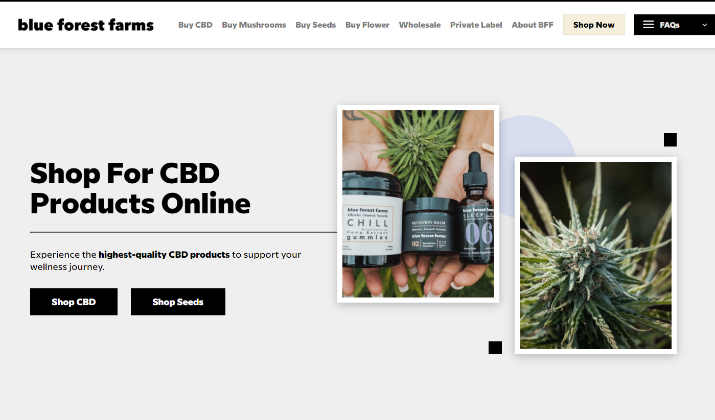
Blue Forest Farms is a 235-acre hemp farm located in Colorado that specializes in producing high-quality CBD products.
It exemplifies a successful Unbounce landing page through its effective communication of brand values, product offerings, and commitment to education within the hemp industry.
Key Features
- Product Offerings: The farm offers a range of hemp products, including high CBD flower, hemp seeds, hemp seedlings, hemp clones, and CBD oil extracts.
- Expertise: With over 40 years of combined experience in organic farming and extraction, the team at Blue Forest Farms consists of farmers, botanists, and extraction professionals dedicated to delivering exceptional hemp products.
- Focus on Wholesale: Blue Forest Farms primarily targets wholesale customers, particularly industrial agricultural hemp farmers in the United States, aiming to supply them with quality hemp seeds and products.
- Marketing Strategy: The farm has engaged in targeted marketing efforts, including SEO and PPC campaigns, to increase visibility and attract potential customers searching for hemp products online.
- Educational Resources: Blue Forest Farms also focuses on providing valuable resources and information for hemp farmers, helping them navigate the industry and make informed decisions.
By leveraging strong visuals and concise messaging, Blue Forest Farms captures the attention of its target audience, which includes both wholesale buyers and individual consumers interested in hemp-derived products.
Explore: Divi vs Elementor vs Oxygen
Conclusion
Unbounce landing pages illustrate the immense possibilities for achieving landing page success through thoughtfully crafted, industry-centered strategies.
By incorporating the key features such as A/B testing and the impactful use of video and imagery, you can design landing pages that resonate deeply with your target audience.
Using Unbounce advantages can transform your lead capture efforts, turning potential visitors into loyal customers.
By continuously tracking metrics and refining your approach based on performance, you set a strong foundation for achieving your marketing objectives.